Understanding the efficacy of Design Handoff from YellowSlice Experts.

Aramide Ogunbewon
Have you ever seen a perfect design turn into a disaster once it hits development? This has led to constant quarrels between designers and developers.A beautifully designed interface, with sleek animations and carefully chosen colours, somehow turns into a clunky, broken mess once it hits developmentThe spacing is off. The buttons dont respond. The flow makes no sense.And then it begins, the blame game.Designers say, Thats not what I designed!Developers reply, Well, thats all you gave us!Product manager says, I thought you said you understood?This is the reality of poor design handoff. Its the silent killer of user experience, the reason behind many frustrated Slack messages, and often, the hidden crack that breaks an entire product pipeline.When a design handoff is rushed or vague, it makes promising products look like a total failure, dead on arrival. However, a proper, well-documented handoff can bridge the gap between idea and implementation.So, what exactly is a design handoff?Design handoff is the transition phase where designers pass their work, including mockups, specifications, interactions, and documentation, to the developers who will build the product. Its not just sending the Figma file. Its the difference between a developer building with confidence and building on assumptions.It forms a part of the design documentationMany design academies dont teach this shared knowledge, which is why well unpack the why, what, and how of design handoffs, drawing on real insights and experiences from the YellowSlice team. Youll learn:
- Why a proper handoff saves time and sanity
- What tools to use for a smoother workflow
- What your handoff should actually include
- And tips (plus mistakes to avoid) that can transform your design-to-dev transition
Lets put an end to the designer-developer drama one handoff at a time.
Why is a Design Handoff Needed?
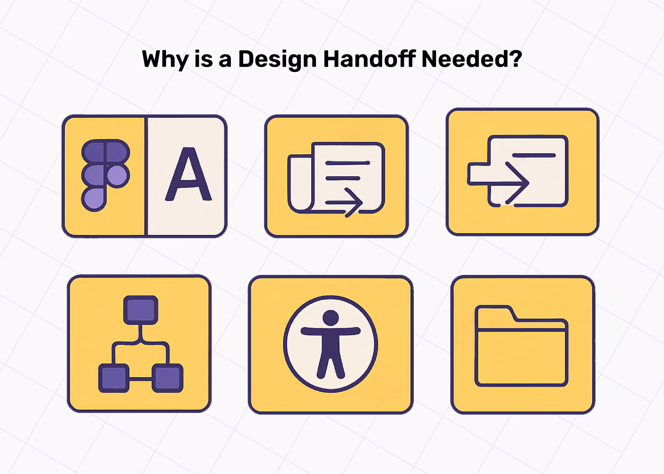
Why do you have to let your product look like a jungle when it gets to the developers? Why do you want to spend 2 years on a product without launch insight? Why do you have to watch your design go down in flames?You dont have to! Design hand off is there to:
- Eliminates guesswork in development: Developers are not mind readers. Without clear specifications, theyre forced to make assumptions. Assumptions lead to inconsistencies, which lead to feedback loops, which ultimately lead to "This isnt what I designed."
A proper handoff provides developers with the exact details to bring the designs to life, from the UI basics to the intent of the UX, enabling it to penetrate human behaviour.
- Saves time by reducing back-and-forth communication: Lets face it! Constant back-and-forth over Slack or meetings asking, Is this padding supposed to be 16px or 24px? is a productivity killer. A solid handoff reduces the need for repetitive explanations, allowing both designers and developers to stay focused on their respective areas of expertise.
- Maintains consistency across platforms: You designed for mobile. The developer built for the web, but now we have a product that requires users to zoom in on before payment, in the process, they send money to the wrong beneficiary.
Without a design system and clear handoff, things get messy. Consistency is not really about trying to tame the creativity of the developers. Its more about ensuring the product behaves and looks the same way, no matter the device or screen size and also to satisfy the demands of difficult clients.
- Prevents misinterpretation of UX flows and interactions: User flows are like GPS directions. If the instructions arent clear, the dev might take the wrong turn. Good handoffs include annotated flows and edge cases, leaving little room for confusion on what happens after a button is clicked or when a form is submitted.
- Supports scalability: What happens when a new developer joins the team, or the main designer is on vacation? A well-documented design handoff becomes a viable option, making it easier for others to pick up from where the last person left off without spiralling into chaos.
Even if the product acquires more users and more features, you can always update the handoff without sweating it.
What to Use for the Design Handoff

Designing is hard, developing is equally difficult, and Handoffs shouldnt be. So here is a list of options to make life easier for both designers and developers. These tools act as the delivery guys that make sure your design arrives at the developers desk just as you intended, no scratches, no dents.Figma: Every designer knows how to use Figma, and developers are already catching up. It is collaborative, version-controlled, and inspect-ready. The all-in-one, crowd favourite.Pros
- Real-time collaboration everyone from PMs to devs can see whats happening, live.
- Version control no more "final-final-v2.sketch" chaos.
- Inspect-ready developers can grab specs, CSS, and variables directly.
Cons
- It can be overwhelming for devs unfamiliar with the interface.
- Needs strong internet lag can be a buzzkill during large file inspection.
Zeplin: Bridges the gap with developer-friendly specs.Pros
- Focused on handoff devs get clean specs without UI distractions.
- The commenting system makes feedback easier across teams.
- It Integrates with Figma, Sketch, and Adobe XD.
Cons
- Not ideal for actual design work.
- Less useful if you already have a structured system in Figma.
UXPin: End-to-end design and documentation for everyone on the team.Pros
- Interactive prototypes that simulate real product behaviour.
- Great for documentation you can add logic, flows, and conditions.
- Works well for end-to-end design-to-dev workflow.
- AI tools to speed up and automate workflows
Cons
- Steeper learning curve for beginners.
- Slightly heavier than Figma or Zeplin for quick handoffs.
Avocode: Good for handing off from Sketch or XD.A go-to tool if youre coming from Sketch or XD.Pros
- Allows you to inspect Sketch, Photoshop, or XD files without owning the tools.
- Easy export of assets, fonts, and CSS snippets.
- Works offline.
Cons
- Not as popular anymore with Figma taking centre stage.
- UI feels outdated compared to newer tools.
Storybook: It is a component-based UI development which makes it very easy for developers to use.Pros
- Developers can build UI components in isolation.
- It acts like a live design system. It is reusable, testable, and shareable.
- Great for collaboration between design and frontend engineering.
Cons
- Not for traditional design handoffs more of a dev tool.
- Designers may find it somewhat too code-heavy.
What a Good Design Handoff Contains
A great handoff isnt just a file-sharing document; its arranging UX Design with intent, logic, and usability into something developers can build without playing detective. Heres what every good design handoff must contain and why its non-negotiable:
Design files
If you are still iterating on a handoff that is meant for developers, then something is wrong somewhere. Its not at the point of development that a client should notice that the sign-in button is not the same shade as the brand colour.The complete, polished design file should be clean, neatly structured and clearly named. There is no reason why a file should be named Homepage v4_final_final_OKAYthisOne.fig, not only is it unprofessional, but it is also very confusing; youre setting the team up for chaos.Developers need to know which version is the official version, so they can start their work and pass it on to the backend, cybersecurity team, or quality assurance.? Pro tip: Organise by screens, group by features, and delete obsolete versions.
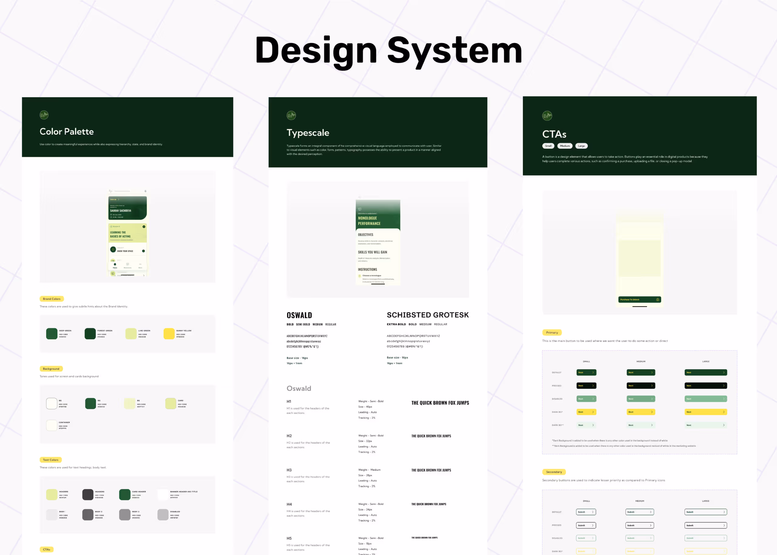
Style guide / Design system
A breakdown of your visual language colours, typography, spacing, button styles, components, and reusable UI patterns. Even without designers, this is a no-brainer for designers to ensure Consistency across the product. It allows developers to think like designers and complete their work more efficiently.
Interaction notes
This contains details about hover states, click animations, transitions, modal behaviours, loading indicators, and responsiveness. Static designs on PDF dont tell the whole story. Interaction notes bring your UI to life by helping devs know what happens when something happens.For Example, what does the Submit button do after it is clicked? Does it change colour? Show a loader?
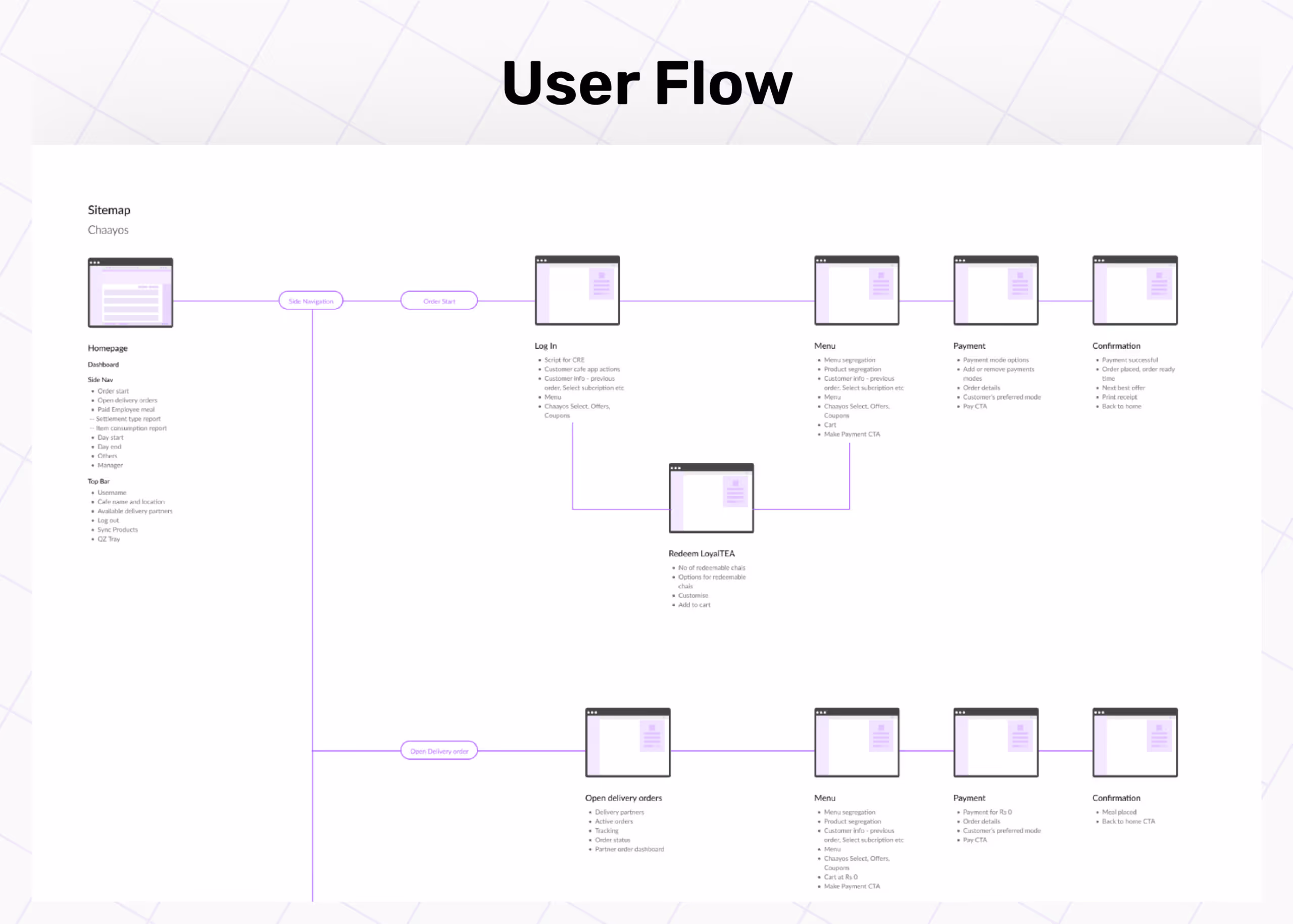
User flows
User flows show how users move through the product. It is a step-by-step visual and written guide that shows users how to move through the product, screen by screen, action by action, and result by result.Developers build features, but flows bring context. This helps them connect the dots beyond individual screens and avoid dead ends or missing logic.
Accessibility standards
It includes contrast ratios, alt texts, and tab order. Accessibility guidelines ensure that your product is usable by everyone, including users with visual, motor, or cognitive challenges. Think contrast ratios, alt text, tab order, keyboard navigation.Its not just good practice. Its an inclusive design. Its legal compliance. And its just the right thing to do.? A great product serves everyone. Accessibility is not optional.
Assets
All visual icons, illustrations, images, animations, and videos should be exported in proper formats and resolutions (SVG, PNG, WebP, Lottie, etc.) and uploaded to a cloud storage for easy access.You dont want to deal with the headache of missing or bulky assets, which can slow everything down. The developers might not have the time to crop your JPEGs. Give them clean, compressed, production-ready files.? Dont forget to name them well. icon-check-dark.svg is better than finalfinal22.png.

5 Tips to Create a Seamless Design Handoff
Unless your handoff game is solid, your masterpiece might as well be a puzzle missing half the pieces. Lets analyse these solid tips you need while creating a design Handoff.
Document as you design
Dont leave all annotations to the end.As youre designing, try to add notes about interactions, spacing logic, accessibility tweaks, mobile behaviour, or that sneaky dropdown that only shows up if a user scrolls past a certain point.You are more likely to remember every detail and processes that you might leave out after a 5-month stretch of designing. You remember why the CTA is aligned right or why the card has a soft shadow at 8dp. Waiting till the end means your handoff becomes a rush job. Youll forget the micro-decisions that make your design functional.It doesn't have to be a fully fleshed-out note or document; it just has to be a pass for you to remember why you decided on the design and why the developer cannot afford to code something different.
Keep it consistent
You wouldnt want one McDonalds selling curly fries in Delhi while the others serve regular fries in Mumbai, especially if you love regular fries and live in Delhi.Inconsistency is the enemy of efficiency. If your button has 8px padding on one screen and 12px on another, or your H1 sometimes uses Inter and sometimes Poppins, it breaks the UIs rhythm. More importantly, it frustrates developers who now have to either guess or ask every time they notice a difference, and neither is ideal.Lean on your design system. Use predefined components, text styles, and spacing tokens. If you dont have a design system yet, this is your sign to start one.
Use components wisely
Designing without components is like cooking every meal from scratch when you couldve just meal-prepped. It's inefficient, messy, and eventually, youll burn out.Components are reusable. Use them for buttons, cards, input fields, navbars anything at all that is repetitive. This doesnt just save time. It ensures every instance behaves the same and makes updates a breeze. Change one master component, and the updates ripple across the file like magic.
Communicate edge cases
An edge case is simply what you did not see coming. Your designs might look great when everything goes right. But what happens when users type the wrong email? What if the search returns zero results? What if the internet goes down mid-payment?Users can do things we cant even imagine, and while you think you have done a good Job with the research, you still need to prepare for edge cases and discuss with the team (especially developers) through the handoff.
- Developers need to know what to build for unexpected behaviour.
- QA teams rely on this info to test real-world usage.
- Users trust products that handle errors gracefully.
So never forget to leave out edge cases while documenting your handoffs. Examples of edge cases to document:
- Empty states
- Loading states
- Error messages
- Form validations
- Long user-generated content (like extra-long names or descriptions)
Walkthrough with developers
Even after writing the best and most detailed handoff, you still need to walk the developers through the scope. Designers dont speak the same language as developers, and that can be a cause of miscommunication.You might think your file is self-explanatory. It rarely is. Developers arent mind readers, and they shouldnt have to be. A 2030 minute walkthrough can save you days of back-and-forth, misinterpretation, and preventable bugs.Use this time to:
- Explain the user flows.
- Point out interaction notes and edge cases.
- Answer why behind certain decisions.
- Clarify structure, breakpoints, and layout logic.
Will handoffs move a project forward or backwards?
That depends on design teams, design structure and organisations.Its easy to blame designers when things fall apart after a handoff. But sometimes, the real culprit hides behind rigid processes, unclear communication, or organisational silos. A sloppy design handoff isnt always a skill issue its often a structural one.When designers are empowered to document clearly, communicate early, and collaborate often, the results speak for themselves. But when theyre rushed, sidelined, or isolated from developers, even the best design can lose its magic before it makes it to production.Great handoffs dont happen by accident; theyre built through systems, habits, and shared accountability. And thats where the right team makes all the difference. At YellowSlice, we understand that design is not just about how it looks; its about how it works, scales smoothly, and how the team behind it operates.Our experts dont just create designs, we build collaborative workspaces that keep designers, developers and other stakeholders on the same page from start to ship. Lets help you handle UX design, more importantly, lets help you handle the transition from design to reality. Schedule a session with us today.
FAQs
1. Where can I find a design handoff template?
You can create one yourself in Notion, Figma, or even Google Docs. But if you want to skip the guesswork, there are free templates on Figma Community and UXPin's library that help you outline specs, flows, and documentation in one place.
2. What is a design handoff checklist?
A design handoff checklist is your sanity-saving list of everything developers need to bring your design to life. Its a list you need to tick as done as soon as you sort out the items. It sort of helps you stay organised and document everything the developers will need.


Let's create something amazing!
Let's discuss your vision and how we can bring it to life with impactful design solutions.
.avif)
Good design starts with Sliced Newsletter
Subscribe to the Sliced newsletter and get the best of research, UX writing, product psychology, CX, and design systems, right in your inbox.
