UI/UX Guidelines for Corporate Banking: Trends, Features & Decision-Driven Design.

The Corporate Banking App is not your everyday mobile banking app. You dont log in to corporate banking just to check your balance or pay your electricity bill. You log in to move millions, manage risk, authorise payroll for hundreds, or track trade finance across continents.The financial ecosystems are shifting faster than we can spell liquidity. Corporate banking is very powerful but also very complex compared to what we see in the regular banking app. Apart from the fact that corporate banking doesnt have a large user base compared to retail banking, why is there little to no importance attached to corporate banking in terms of UX and financial technologies?Many corporate banking apps feel like they were made years ago. They look really intimidating for someone trying to manage their corporate transaction digitally. If they can make personal transactions easily and seamlessly, why not corporate banking?While startups in retail banking race to dazzle Gen Z with neon interfaces and smooth swipe-to-pay experiences, corporate banking has been cautiously walking a tightrope: trying to balance security with usability, complexity with clarity, and legacy systems with modern expectations.And yet, its impossible to overstate its role in the financial ecosystem.Corporate banking powers the backbone of economies. It helps businesses scale, governments finance infrastructure, and institutions manage wealth and liabilities. From small and medium-sized enterprises (SMEs) to multinational giants, it serves the clients who keep industries running.But serving these clients isnt as simple as designing a clean dashboard or adding a chatbotits about deeply understanding the weight of each transaction, the risks behind every decision, and the speed at which these decisions need to happen.Lets unpack corporate banking, who its for, and why its design demands are nothing like retail bankings. Well also explore the design tension that lies at its core: how do you create digital experiences that are functional enough to handle the complexity of billions without breaking the user?
What is Corporate Banking?
Corporate banking isnt a trend or a buzzword. Its a backbone.At its core, corporate banking is the arm of a bank that deals with businesses instead of individuals. Just see it as the B2B customers of the banking industry. And no, were not talking about just any business. Were talking SMEs, large enterprises, conglomerates, and institutional clients that operate at high stakes and higher volumes.The primary purpose is to provide these organisations with the financial tools and advisory they need to operate, expand, and stay afloat in volatile markets. From working capital loans to treasury services, international trade support, structured finance, and foreign exchange. Corporate banking is where the money moves at scale.These clients dont need budgeting tips or how to build credit advice. They need real-time access to liquidity, multi-user authorisation for transactions, sophisticated reporting tools, and multi-country account management. And they need it in a way thats secure, compliant, and fastno room for lag, confusion, or friction.
Who is Corporate Banking for?
- SMEs (Small and Medium Enterprises): Usually navigating growth, looking for credit facilities, cash flow management, and cross-border payments.
- Large Enterprises: Managing complex operations across divisions, needing advanced treasury and risk management.
- Institutional Clients: Think insurance companies, asset managers, pension fundsoften with unique regulatory and liquidity demands.
Each group has wildly different needs, but one thing is consistent: the stakes are always high. A wrong click or a system error isnt just annoyingit could mean millions lost or reputational damage.
Complexity vs. Usability in Corporate Banking
Designing for corporate banking is not necessarily about stripping things down to the bare minimum. Its about knowing what to simplify, what to surface, and what to safeguard.Theres an unavoidable complexity baked into these workflowsmulti-level approvals, audit trails, bulk uploads, real-time monitoring, etc.But that doesnt mean the user experience should suffer.This is where good UX becomes less about aesthetics and more about decision design. What happens when a CFO logs in to approve a high-value transaction? Can she trust what she sees? Is the risk displayed? Is the interface smart enough to suggest anomalies before they become problems?Corporate banking app needs form, function, and foresight.
Difference Between Corporate and Retail Banking
You may ask, what is so different about corporate banking and retail banking? After all, they both exist to send money. So here you go:
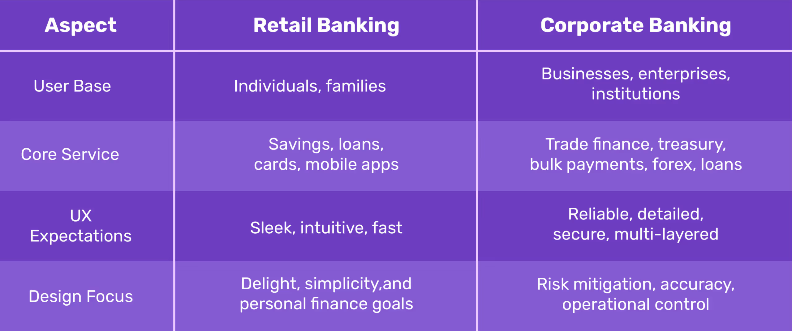
Retail users want to track spending, automate savings, and get reward notifications. Corporate users want bulk approvals, audit logs, risk analytics, and custom dashboards. Its not simple vs. complicatedits consumer emotion vs. enterprise precision.
Importance of UI/UX in Corporate Banking Apps
For far too long, the sector has been dominated by clunky portals, intimidating dashboards, and workflows that feel more like decoding a secret strategy than managing company finances. But todays enterprise usersCFOs, finance managers, operations headsarent settling for unintuitive interfaces anymore. This is where design becomes a competitive advantage.
UI/UX Design Is Leverage.
Forget the idea of design as just visually appealing, you know, with icons, colours, gradients. Thats surface-level. In the corporate banking space, design is infrastructure. It dictates how fast a business leader can move money across borders, how easily a startup founder can manage working capital, and how quickly an enterprise can analyse financial risk.Think about it:
- Can a CFO approve five high-value transactions within three clicks without missing a beat
- Can a small business owner track incoming payments and immediately see flagged anomalies?
- Can a finance team run liquidity forecasts while toggling between loan schedules and cash flow reports, without getting lost in a maze of tabs?
If the answer is no, you dont have a design problem. You have a business risk.
Intuitive Interfaces Build Trust in Business Owners
Now, lets talk about trustthe trust your user develops over time of using the app without complications. Not just the kind you build through security protocols and compliance certificatesthose are expected. We're talking about emotional trustthe kind that makes a finance team confident enough to rely on your platform as a daily workspace, not just a banking tool.
- A clear, responsive UI says: We know what matters most to you.
- Logical flows and predictive actions say: We understand how you work.
- Smart defaults and contextual prompts say: Were here to reduce your cognitive load.
Good design, in this space, is what makes high-stakes decisions feel low-effort.When dealing with multi-currency accounts, international payroll, or real-time treasury insights, manual and human error is bound to happen, and its annoying and also very dangerous.Nothing slows down productivity like doubt or having to make multiple revisions and checks before hitting the send button.
Design Directly Influences Business Decisions
Design is not a support function; its part of the decision-making engine and should be treated as such. When corporate banking apps surface the right data at the right time, decision-makers can act quickly and with clarity. Heres what that looks like:
- Quick Access to Liquidity Data: A clean, visual dashboard showing available cash across accounts in real time allows businesses to act fast, whether seizing a market opportunity or covering unexpected expenses.
- Smart Alerts and Custom Notifications: Instead of forcing users to dig through tabs, the system tells them whats urgent, whats unusual, and whats next.
- Loan Management at a Glance: When loan repayment schedules, interest accrual, and disbursement status are accessible in a single view, finance teams are empowered to strategise rather than react.
See how good UX means better business? Because in a space where financial health is on the line, the quality of user experience directly correlates with operational speed, decision accuracy, and customer loyalty.A well-designed interface shortens the time between insight and action. Thats the kind of edge every enterprise wantsand needs.
A good UI/UX Design Helps Prevent Financial Risks.
Compliance failures cost moneythey cost reputation! Corporate banking institutions are held to the highest legal and financial scrutiny; even a single oversight can mean millions in regulatory fines, frozen accounts, or, worse, loss of client trust.But heres what most people miss: good UI/UX is one of your strongest first lines of defense against financial risk.Yes, you read that right.A good UI/UX Design focuses on designing with precision, for accountability. One good design strategy can be anti-money laundering (AML) and security compliance, not just as back-end tech safeguards, but as user experiences that need to be understood, adopted, and executed properly by humans.If the interface is unclear, confusing, or buried under poor workflows, users are more likely to bypass the system, or worse, make dangerous errors without even realising it.Heres what thoughtful design can do:
- Clarity in Transaction Flags: Interfaces can highlight suspicious activity in digestible waysthrough smart alerts, visual risk scores, or contextual promptsrather than hiding them in complex report logs that nobody reads.
- Friction in the Right Places: While friction is often a dirty word in UX, in financial platforms, it can be life-saving. A well-placed confirmation screen, document upload request, or identity re-verification can stop a high-risk transaction dead in its tracks.
- Educating Users in Real-Time: Microcopy, modals, and inline guidance can educate users on the why behind certain compliance actions. This not only improves adoption but builds trust. People are more likely to comply when they understand whats at stake.
- Role-Based Access and Permissions: A good design system ensures the right people see the right information. It limits exposure, reduces error, and supports internal audit trails. In regulated industries, this isnt just helpfulits essential.
- Seamless Reporting & Traceability: UX can make compliance reporting easier, faster, and more accurate. Intuitive dashboards and exportable data views allow teams to respond to audit requests and regulatory reviews without a 2-week scramble.
Sometimes, Money laundering doesnt always happen because of bad actors; it often happens because of bad systems. A confusing user interface is a bad system, take it or leave it.When platforms are poorly designed, frontline users make avoidable mistakes. But when you combine clarity, accountability, and user guidance into the interface, you're not just preventing design debt. You're protecting the business from reputational and regulatory fallout.This is why UI/UX in corporate banking is a part of your risk management strategy. Regulators are watching, competitors are evolving, thats the kind of design strategy that keeps you both safe and ahead.
UI/UX Laws That Influence Corporate Banking Design
Corporate banking must think, act, and protect like a financial strategist. Design is where psychology meets money. And the best banking experiences? Theyre built on UX laws that humanise all the numbers and transactions you see on screen.Lets break down the laws every banking product team should write on their dashboardsespecially if youre designing for complexity, compliance, and corporate clients.
1. Hicks Law: When Less Is More
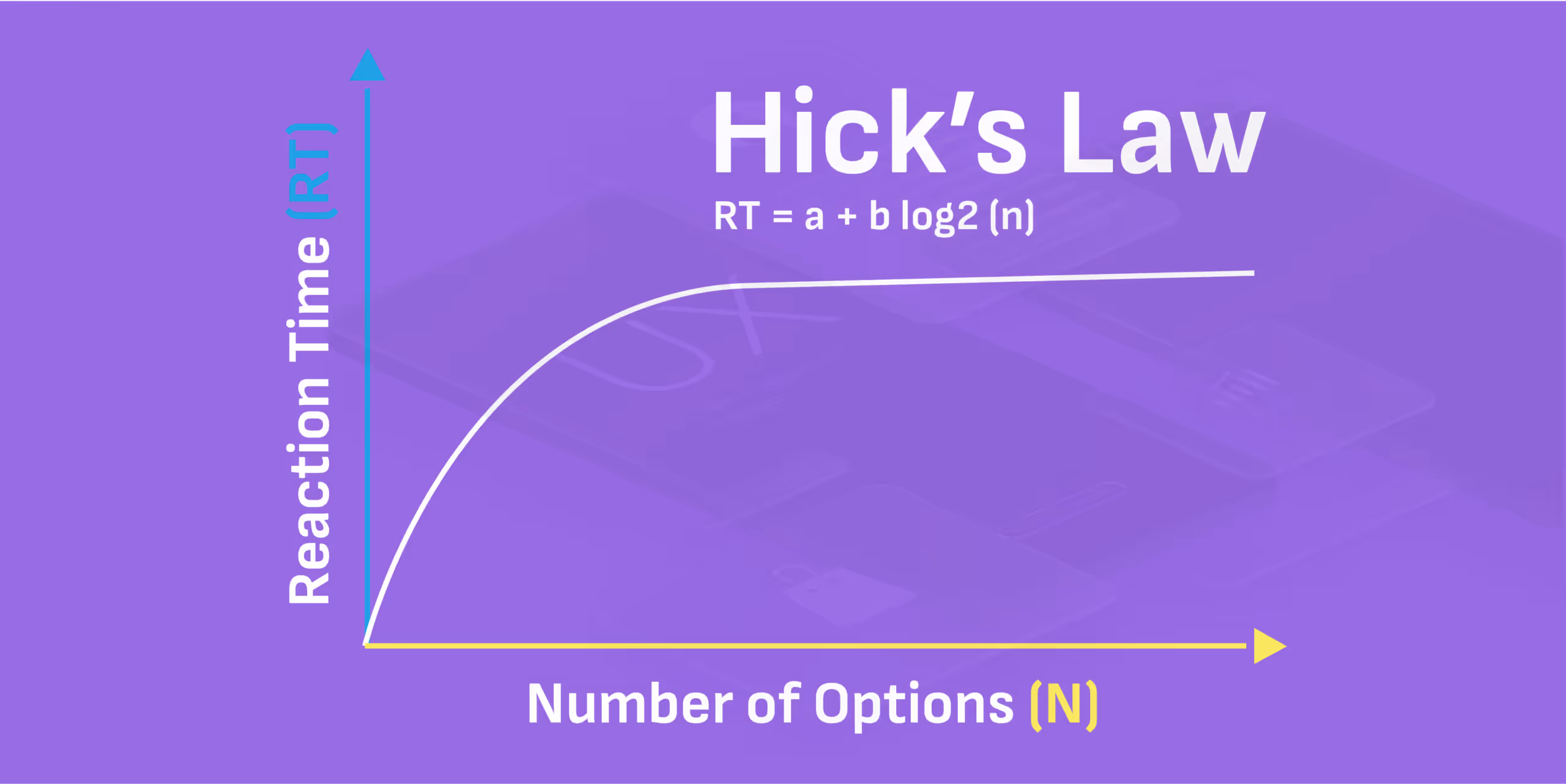
Corporate banking apps tend to overwhelm the user with multiple options. If the users is not juggling multiple accounts, they are on foreign exchange, or reading up about the loan structures, and revising the transaction histories. Their task is almost endless and usually at the same.Hicks law states that the time it takes to make a decision increases with the number and complexity of choices. This law helps designers to simplify decision-making for users. Fewer choices = faster decisions.But lets pause: do users really need 12 side panel options and three overlapping modals to transfer funds?No. They need clarity. Not chaos. This is where great banking app UI design earns its paycheck. Hicks Law tells us to strip down excess choices. Think: grouped tabs, progressive disclosure, and smart defaults.Youre not just making the app look clean. Youre engineering decision-makingreducing cognitive friction so CFOs and finance heads can move faster, safer, and with full confidence.So the next time someone says lets add another button, ask yourself: Would Hick approve?
2. Fittss Law: Size, Distance, and the Art of the Tap
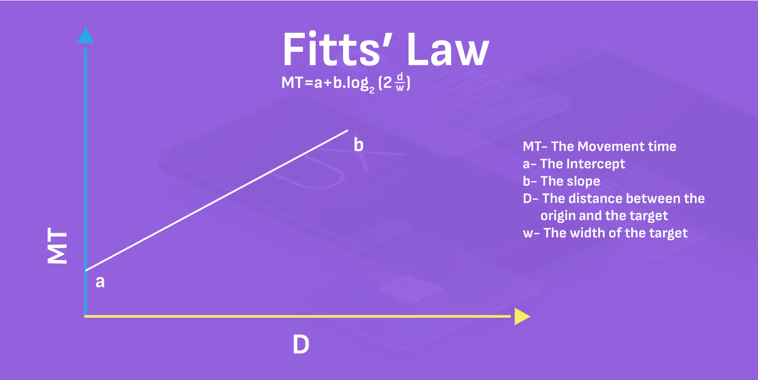
Fittss Law reminds us that the time it takes to reach a target (button, link, CTA) is a function of its size and distance from the users starting point. In human terms, dont make your users work hard to hit the right button, especially when that button is tied to a wire transfer or bulk payment action.This is where many corporate banking apps fail. On mobile, button padding and hit zones are criminally neglected. On desktop dashboards, actionable buttons are either too tiny or buried in hard-to-reach corners.Corporate users arent browsing for leisure; theyre managing money under pressure.If the "Approve Transaction" button is:
- Too small
- Too far from context
- Or too close to a "Reject" button
- Squeezed into other irrelevant content
You're creating risk, not just a bad experience.Design for speed and precision. Group-related actions include increasing tap targets and never compromising clarity for aesthetics. Fittss Law is a mandate for stress-free financial control.
3. Jakobs Law: Familiarity Builds Instant Trust
Jakob Nielsens Law states that users spend most of their time on other sites, so they prefer your product to work like those. Familiarity with Fintech products is essential while enhancing the user experience. So it is better to stick to proven patterns to reduce the learning curve and build credibility.Now, this might ruffle a few design feathersbut read this.In banking app UI design, novelty is not the real deal you think it might be, especially for enterprise clients. Familiarity is. Users dont want to learn your interface. They want it to feel second nature from the first login.Use standard icons for transactions, search, or downloads. Stick to widely accepted layouts for dashboards, calendars, and payment flows. Save your creativity for micro-interactions or subtle animations, not core navigation.Even in banking counter design, physical branches that mimic customer expectationsclear signposting, private consultation zones, intuitive kiosk placementoutperform those that try to reinvent the wheel.Familiarity = speed.Speed = trust.And trust? Thats the real currency in corporate banking.
4. Millers Law: Dont Make Them Think (Too Hard)

Millers Law tells us that an average person can only hold 7 2 items in their working memory at a time.Now, think about the last corporate banking dashboard you saw. Twelve widgets, four tabs, Dynamic charts, Hover-based tooltips, and a floating CTA blocking half the screenthe list of flawed UX is endless!No wonder users call support to ask where the download receipt button is.Heres what banking app UI needs to do better: prioritise, reduce noise, and break down large data into digestible clusters. For instance:
- Instead of displaying 18 KPIs, highlight three vital ones with deeper drill-downs.
- Use collapsible menus for optional insights.
- Colour-code transaction statuses for instant scanning.
When the mind isnt overwhelmed, decisions become faster, more accurate, and less emotionally taxing. Thats how you turn complex finance into confident action.
5. Peak-End Rule: First Impressions Matter
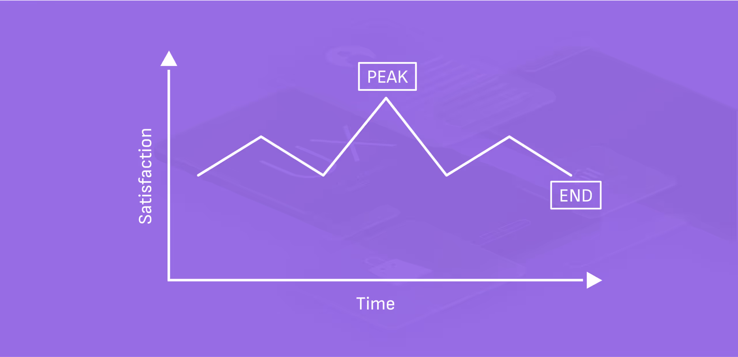
No one logs into a banking app UI just to admire the colour palette. Theyre here for outcomes. Quick wins. Confirmations. Receipts. Relief, and that is why how you end a user journey matters more than how you begin it.The Peak-End Rulea principle from behavioural psychologystates that people judge experiences based on how they felt at the most intense moments (the peaks) and at the end rather than the entire duration.Most user journeys in corporate banking apps are long, number-heavy and sometimes nerve-wracking.So the peak end rule allows designers to ease the tension with small moments of delight, especially at the end.Example:
- A CFO just initiated a high-value transfer
??
- The transaction succeeds.
??
- A sleek animation pulses: ? "?10.5M sent successfully. Funds will reflect in 2 mins."
??
- Below it? A Download Receipt button, and a subtle thumbs-up emoji: "You're on a roll today."
These micro-moments are powerful because theyre the last thing the user remembers. And in enterprise banking, where decision fatigue is real, the last action can be the difference in building trust, efficiency, and long-term satisfaction.Its the same psychology behind great bank counter design. The user might have waited for a long time, or the teller may be professional throughout, but its the warm smile and Youre all set at the end leaves a lasting impression.Design your finishes like you're sealing a dealbecause you are.
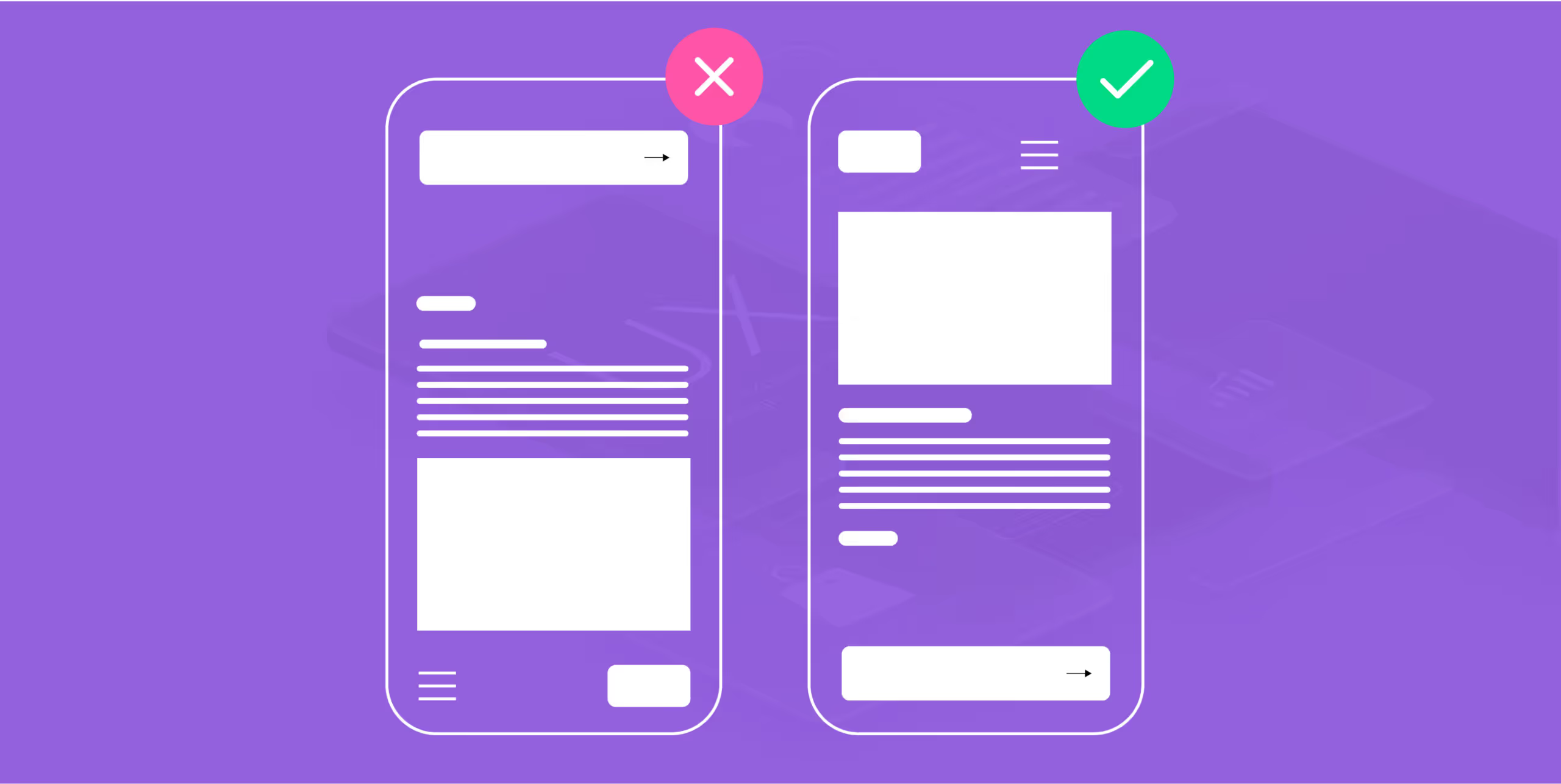
6. Law of Progressive Disclosure: One Thing at a Time

Most fintech designers learn the hard way: just because the user can see everything doesnt mean they should. The Law of Progressive Disclosure says that we should present only the essential information first, and reveal more complex details only when the user is ready or needs them.In other words: Dont data-dump. Prioritise, layer, and unveil. Why is this very important in banking app UI?Because corporate users are already managing:
- Cash flows from multiple branches
- Vendor payments
- FX rates
- Loan EMIs
- Compliance flags and so much more
The nature of corporate banking is already too much for an average user. Now imagine throwing charts, ledgers, approvals, and fund limits all on the first screen. It's like walking into a bank counter where every staff member starts talking to you at once.Progressive disclosure helps by:
- Showing only todays tasks on login, with expandable views for past activities.
- Keeping the loan breakdowns hidden until Details is clicked.
- Nesting transaction filters under collapsible menus.
- Using hover states or tooltips for definitions and data insights.
This approach respects your users cognitive bandwidth. It empowers them to pull in little by little, not be pushed around by everything.Plus the laws also aligns beautifully with Hicks and Millers Laws by avoiding information overload. Even something as simple as a dashboard panel has benefits:
- Overview ? Summary of last three transactions
- Click ? Full ledger
- Drill-down ? Receipts, timestamps, approvals
How you can use these UX Laws in Dashboards & Transactions
If youre designing a multi-currency transaction dashboard for a global bank.
- Hicks Law helps you segment the flow: Choose currency ? Select payee ? Enter amount ? Confirm. Not all options at once.
- Fittss Law ensures large, clickable "Send" and "Save Draft" buttons sit where the user expectsno pixel hunting.
- Jakobs Law means sticking to familiar layoutsleft navbars, top search bars, bell icons for notifications.
- Millers Law prompts you to group transactions by week or priority, rather than dumping raw numbers.
You can see that they are not just theories. You need to make efforts to use at least one law in your daily design decisions. By the end of your three-month project, youll have used these rules perfectly to design trust, precision, and business growth.So if youre building the future of corporate finance, remember: Good UI doesnt just look right. It feels right. And it thinks ahead.
Trends in UI/UX for Corporate Banking Apps
The UX laws youve learnt will not be very relevant if you cant apply them to trends in the industry, both in UX and Corporate Banking, so here you go!
- Minimalistic and modular dashboard design: If you pay attention well enough, youll notice that clarity has been emphasised repeatedly.
- Modern dashboard UI design has moved toward modular structures, such as drag-and-drop widgets, customisable panels, and KPI-first layouts, which empower users to see only what matters most. Why?
- It reduces noise, increases task efficiency, and you remember Hicks Lawbecause fewer visible choices mean faster decision-making.
- Hyper-personalisation through AI: If designers dont catch up with AI, theyll be caught off from the industry. It is the duty of UX Designers to emphasise the need for AI integration in the backend and design how it would look in the frontend for users.
- This personalisation can prioritise loan schedules based on user history, recommend transaction templates or even Surface alerts that matter. Hyper-personalisation ensures every CFO or finance head logs in to a dashboard that knows what they need, even before they do. Its like having a financial analyst embedded in your interface.
- Voice UX and natural language queries: Voice search and NLP-powered commands are making waves in the B2B world, too. Imagine this: "Show me all transactions above $50K from last quarter," and then your dashboard UI renders a clean, filter-ready table in seconds.
- It helps the user think aloud and consider their decisions before making any decision. It also supports multitasking for decision-makers.


Let's create something amazing!
Let's discuss your vision and how we can bring it to life with impactful design solutions.
.avif)
Good design starts with Sliced Newsletter
Subscribe to the Sliced newsletter and get the best of research, UX writing, product psychology, CX, and design systems, right in your inbox.
