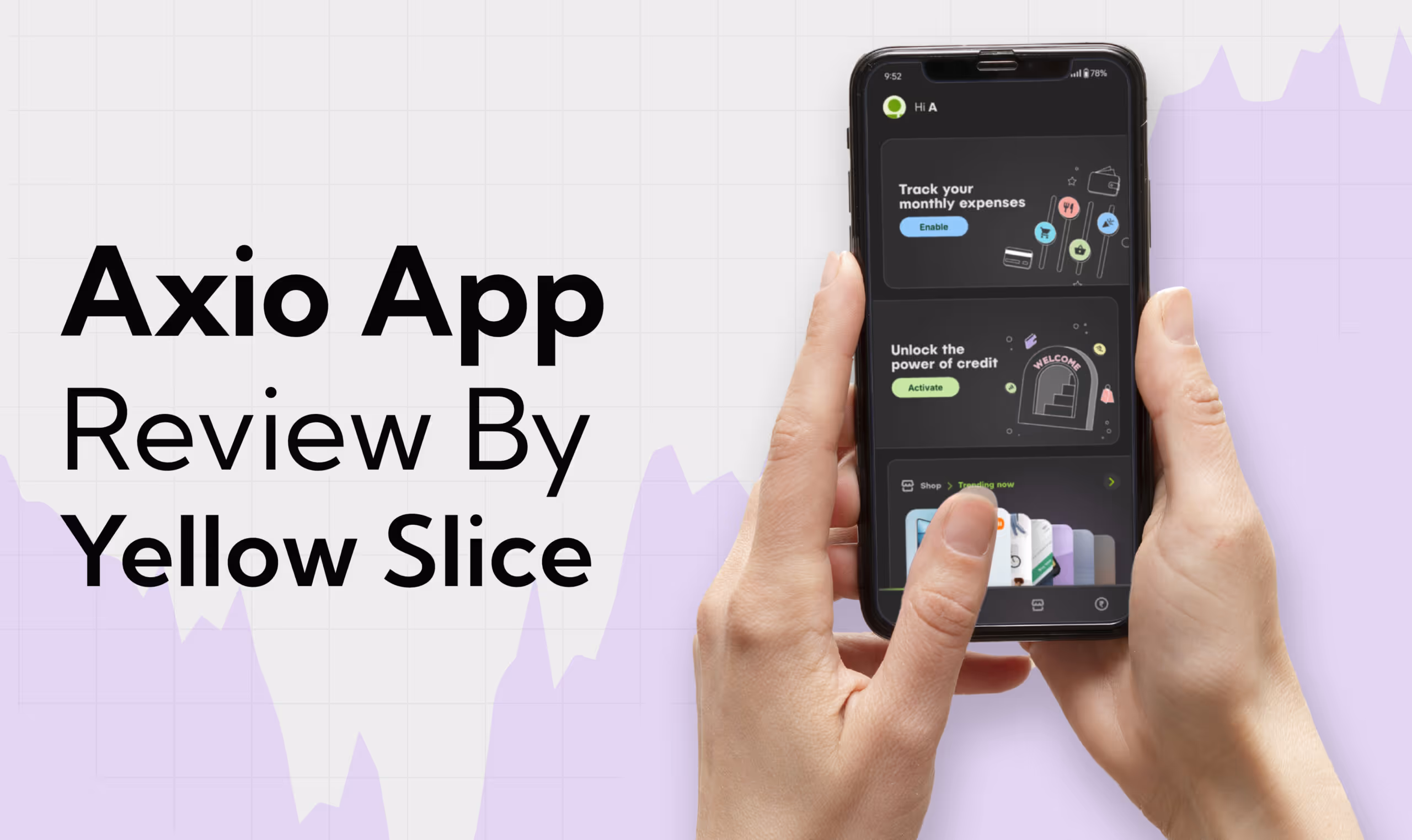
Axio App Review by Yellow Slice: How to Make it Better
Ritika Singh
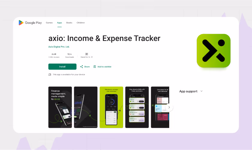
Have you been wanting to buy a laptop for yourself that could land you your dream career? Or have you been trying to build a gym and need machinery from Decathlon, but your budget is stopping you?Axio has got your back! Axio is an SMS-based money management app that makes personal finance a smooth sailing experience. Gone were the days when you had to prove your worthiness to get the credit, but here, the term Axio is derived from the Greek term Axios which means worthy. So, for them, everybody is credit-worthy.With Axio Pay Later, you can purchase online on the partner website and access a pay later limit on the payments page. This lets you shop immediately and make payments within 30 days or with EMIs ranging from 3 to 18 months.Users can also track expenses, plan budgets, monitor daily and monthly expenses, stay on top of bills and receive timely payment reminders. Other services include booking fixed deposits without requiring a bank account within 3 minutes with a completely paperless process backed by security.With one crore plus downloads on the Play Store, Axio is proud of serving more than 15 million customers and enabling more than 3000 merchants while providing credit to more than 9 million users.Axio was founded in 2013 by Gaurav Hinduja and Shashank Rishyasringa, two fintech revolutionaries. The company was initially called Capital Float but later unified with Walnut and Walnut 369.
The Rise of Axio Apps Popularity
- The idea of the Axio app is unique because of their practice that everybody is worthy of credit by reimagining credit systems designed to keep inclusivity in mind.
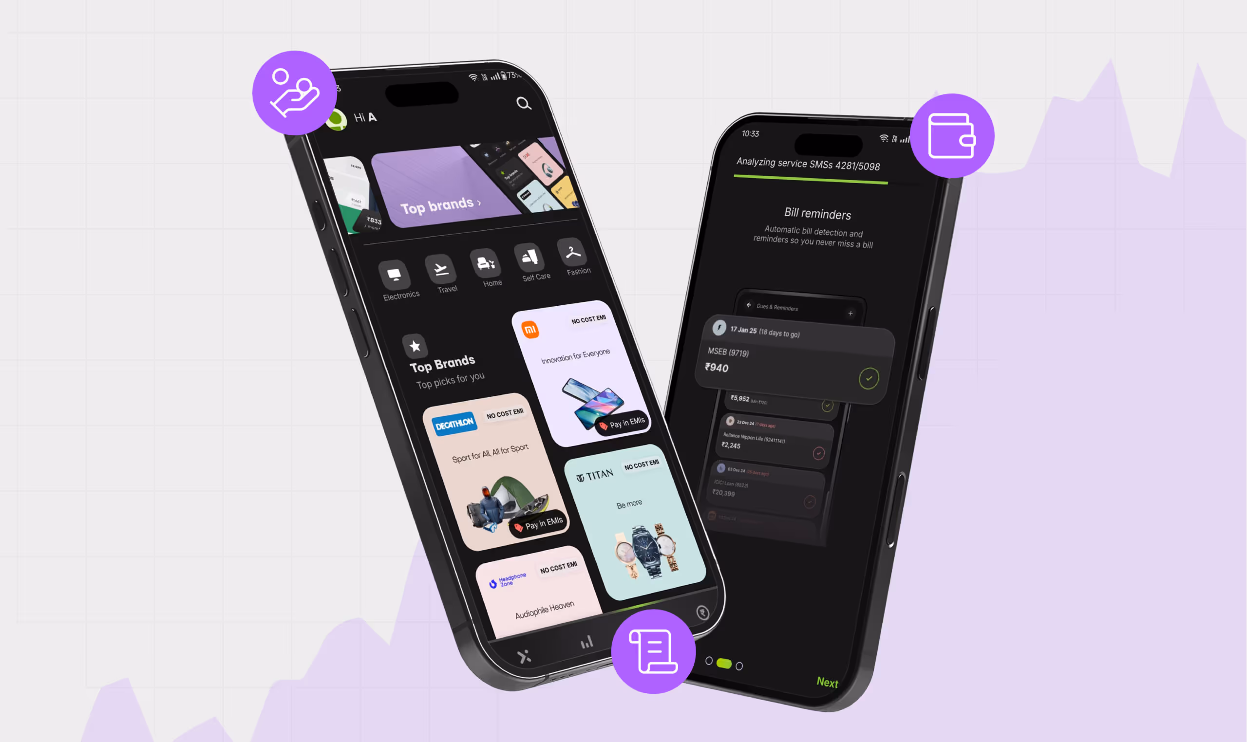
- The Axio app's partner brands include renowned names such as Decathlon, Xiaomi, Titan, Kent, Blackberry, and more. The app's association with such huge names in the industry makes it easy for users to trust it.
- The app's visual and functional design includes an intuitive interface, seamless integration, and clear layout, making it attractive for users to return to use it.
- Fintech apps like the Axio app are bound to be trustworthy and provide all the features in one place, be it personal finance management, buy now pay later services, or tracking expenses with minimal effort.
Despite these reasons, why does the Axio app only have a 4.4 rating on the Play Store? Yellow Slice designers and researchers tried to find the reasons behind this and eventually suggested ways to improve the app's experience.Almost everybody these days uses fintech apps for one function or another; hence, everybody has an opinion on what they like or dislike about the Axio app. User feedback is the best teacher if designers are willing to listen to it with all ears.The reviews were gathered from trustworthy sources, such as the Play Store App Store, where real-life users leave their opinions, and we interviewed some real-life users.
From Data to Decision #UserFeedbackDecoded
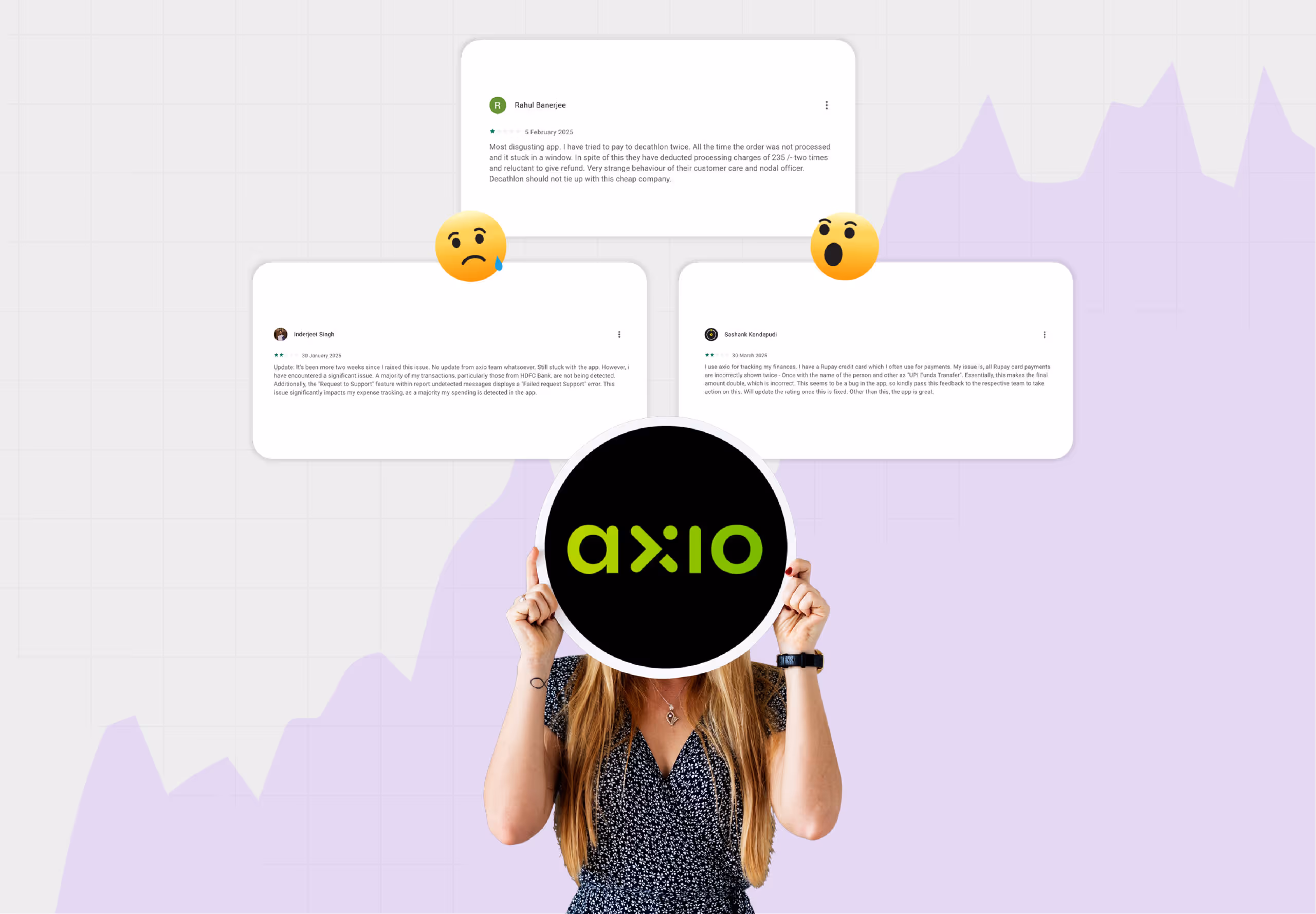
- Users have complained about getting too many ads and spam calls from the platform since Walnut turned its face from Axio.
- Users also noticed that when they opted for a refund, the linked account they wanted to get a refund was wrong, so they were losing their money.
- Fintech apps are usually not so enjoyable to use. Hence, users have suggested including graphs and charts to make the app more interactive and intuitive.
- Users find it a tedious task to add expenses manually every single time; a feature where they could add multiple expenses together using a spreadsheet would be appreciated.
Axio UI & UX Review Led by YellowSlice
Reviewed by Sandra PV, Adisha Mandalik, Aashvi Sheth, Steve Nazareth, Srishti Maurya, Ishwari, Harshini, Shital More, Sonal Vishwakarma, Sagar Bhole, Samruddhi Pawar, and Ashesh Gohil.Below, we have mentioned a few loopholes that we could find in the UI and UX design of the Axio app. We dont just stop at finding discrepancies but also suggest valuable suggestions to improve the overall user experience of the app.
Design lacks consistency
Splash screens, also known as launch screens or startup screens, are initial screens that appear when a software application launches. Usually, a logo, company name, or a brief visual element is displayed while the user waits for the content to load.These screens arent supposed to have actionable buttons; however, in the UI of the Axio app, a few screens resemble splash screens but have actionable buttons at the bottom. Loading screens should look like loading screens and not splash screens.
No validation for user actions
When users act successfully or unsuccessfully, theres usually a validation state that tells whether their action was successful or unsuccessful. That validation is missing in the Axio app, so users dont have clarity on what to do next.
Unclear legends
The legends in the design are unclear at first glance, and some are visible but not displayed on the trends chart.In UI/UX design terminology, a legend refers to a visual key that explains what different colours, symbols, or patterns mean in data visualisation, like a chart or map. This helps users understand the information presented by associating visual elements with their corresponding data points.Non-uniform CTAsThe design's CTAs are inconsistent, creating confusion among users who cant comprehend how to interact with a button.
Key Design Considerations to Boost Axios UX and UI ??
Below, we have mentioned a few pointers, if considered by the Axio app designers, which could enhance the app's user experience.
Consistent design is intuitive.
UI does not just please the eyes; it also makes the design intuitive. So, designers are advised not to put actionable buttons on screens that resemble splash screens.The design of the expense tracking part can be improved, too, by taking inspiration from competitive apps.
Validation states bring user clarity
Validation states should be added because they provide immediate feedback to users about the data theyre entering and their actions on the digital product. This prevents errors, guides users in the right direction, and makes the overall experience more intuitive.
Make clear legends
Incorporating well-defined, clear legends will explain the colour coding, making it easy for users to interpret the data accurately. At first glance, it should show users what symbol or colour represents what.
CTAs that speak for themselves
Ensure all the CTAs look like buttons and that users instantly recognise them as something they can interact with. Make sure that they are consistent throughout the design so that its easy for users to perform the action the app wants.
Expert Review by Yellow Slice
Some of our design agency's expert designers and colleagues used the Axio app, so we got opinions from some first-time and experienced users. This was paramount in our research because fresh views are essential for non-biased reviews.The Internet is always a good place to find how users feel about a specific app, what they like, and what they are putting up with.If you wish to use our expertise to break down your digital product, contact us at Yellow Slice. We bring a team of expert UI UX designers to gauge what your competitors are doing right that you can incorporate into your design and what unique ideas you can get to the market for everyone to follow.

FAQs Decoding the Axio Experience
1. What are the few things the Axio app is nailing at regarding its UI and UX design?
The Axio app has some scope for improvement, but it absolutely nails a few UI and UX design elements. For example, users appreciate their automated expense tracker, and they dont have to use multiple fintech platforms for different functionalities; they can just use this one app to satisfy all their needs.
2. What gaps in the Axio app's UI and UX design could they fill?
The Axio app has an impressive UI and UX design, but a few suggestions to improve their overall app performance are in some of the screens. The back option is at the bottom left, and the next option is at the bottom right, which can be confusing for users to navigate.In fintech apps, security is of prime importance. When the Axio app was still handled by Walnut, the security that the app provided was of the utmost, but users have been complaining about that since Walnut left Axio. A third party handles data processing, and users are no longer comfortable with security.


Let's create something amazing!
Let's discuss your vision and how we can bring it to life with impactful design solutions.
.avif)
Good design starts with Sliced Newsletter
Subscribe to the Sliced newsletter and get the best of research, UX writing, product psychology, CX, and design systems, right in your inbox.
