Splitwise App Review - UX/ UI Improvements
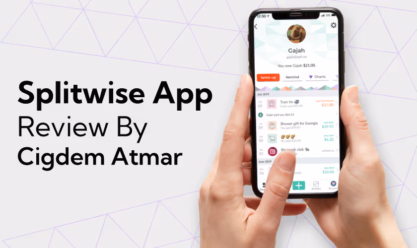
Ritika Singh
If you go out with a friend group, you must have heard of or used Splitwise; if you havent, well say youre a loner. Founded in 2011 in Rhode Island, US, Splitwise is a free web and mobile app that has become the first choice for roommates, travellers, couples, and friends to organise shared expenses.
With Splitwise, you wont have to take mental notes of expenses and ask questions like, "Who owes who?" Whether you are a couple living together, roommates who don't want to feel the awkwardness that money brings, or travellers who go on trips often, install Splitwise. You can easily add expenses you guys are spending to settle them later.The app splits the cost and shows who owes what amount at a glance. Later, you can use platforms like Venmo or PayPal to pay and receive the money. Splitwise is gaining popularity worldwide and has tens of millions of registered users.Fintech has a long way to go. According to Plaid, nearly nine out of 10 consumers will have adopted a form of fintech by 2021. In April 2021, Splitwise, a fintech software company, received $20 million in funding from the private equity firm Insight Partners.
The Rise of Splitwise Apps Popularity
- Splitting expenses between friends evenly by percentage or based on individual itemised costs is more strategic.
- Integration with popular payment apps like Venmo and PayPal helps users trust the platform and kill two birds with one stone: dividing the expenses and paying the dues.
- Splitwise supports 7+ languages and 100+ currencies, which cater to a worldwide audience.
- The cloud-based Splitwise app is available for iPhones, Android devices, and computers; the flexibility of devices is another upside of the platform.

From Data to Decision #UserFeedbackDecoded
- Splitwise used to boast about its free app, and users loved using it. However, the platform offers advanced features only when users subscribe to the app's Pro version.
- Users have been complaining about the recently implemented strict limit on the number of transactions (2-3) you can add per day in the free version, which is inconvenient for frequent users.
- Another complaint that users have is that there are too many ads. They dont want to deal with them, so they have to watch 10-second ad breaks between the 23 transactions they are allowed daily.
- Users have to use apps other than Splitwise to settle their debts, such as PayPal, Venmo, or Google Pay. Theres an option to use Splitwise Pay, but it has its difficulties.
Our designers at Yellow Slice researched to fill the gaps in Splitwise's performance. We used Google reviews, Apple reviews, real-life interviews, and other online platforms to know how users feel about the platform.Why does the app only have 3.9 stars out of 5 on the Play Store, even though its the most used platform for splitting expenses between friends? These real-life reviews spotlight where the app can improve and what positive features it can retain.Feedback is the best teacher; hence, understanding user expectations can enhance the app's user experience by leaps and bounds. Iteration in designs is your best bet to bring ideal outcomes.
Splitwise UX Review Led by Cigdem Atmar, A Design Expert at YellowSlice
Reviewed by Cigdem Atmar, Sandra PV, Adisha Mandalik, Aashvi Sheth, Steve Nazareth, Srishti Maurya, Ishwari, Harshini, Shital More, Sonal Vishwakarma, Sagar Bhole, Samruddhi Pawar, and Ashesh Gohil.These observations resulted from the in-depth research conducted to determine how wise the user experience of Splitwise is.
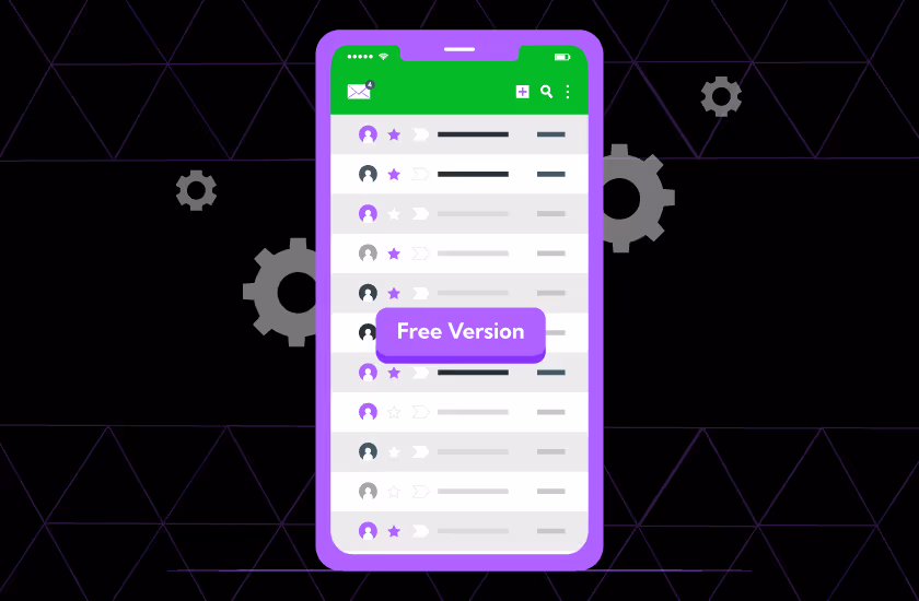
The Free Version Can Go Only So Far
The free version of the app lacks many features, such as the ability to perform more than 34 transactions daily, and the recurrent ads are a huge annoyance for users.The Splitwise Pro version costs $5 monthly and has fewer ads, but users hesitate to pay that fee for such a simple service. Many basic features, like flexible expense splits and export options, are locked behind a paid Pro version, which feels restrictive to users.
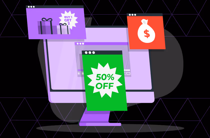
Ads Overload
One way Splitwise's free version used to make money was through showing ads, but a 10-second wait break between those three free transactions that users are allowed in the app is what makes the users most frustrated. Some ads dont even have a skip button, making it hard for users to return to this app.
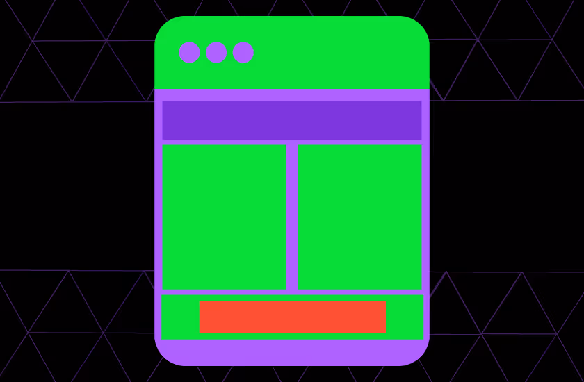
Cluttered Vibe All Over
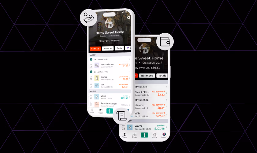
Another area where Splitwise falls short is its user interface, which some users find cluttered and confusing, making it difficult to see what they owe.The interface and the calculation used to calculate debts in the Splitwise app are cluttered and complicated, too. It runs quickly but doesnt provide the right answer.
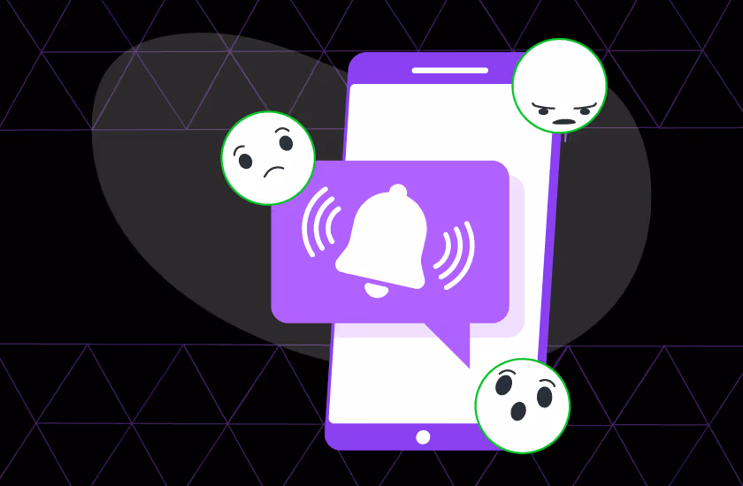
Too Many Inconsistent Notifications
Fintech apps should have a linear function, especially in their notifications. Splitwise offers inconsistent and unreliable notifications, which makes users distrust this app. Sometimes, the app doesnt supply any notifications unless the user opens it; other times, there are numerous notifications as soon as the user checks their mobile device. This is one reason why users search for alternatives to the app.
How Designers Can Make Splitwise Even Wiser ??
Yellow Slice designers took it upon themselves to suggest ways that designers can opt for to make Splitwise perform better. Not just Splitwise but entrepreneurs moving forward with their new designs can also incorporate these suggestions into their existing and upcoming designs. All of us know how a few design audits from time to time can keep you ahead of the game.
Be More Generous with the Free Version
Splitting expenses between friends is a service thats not huge, and users can split expenses by using inbuilt free apps like a calculator for calculating and a notes app for keeping a note of expenses to keep track. Paying $5 for such a service will not make sense to most users.Splitwise should either reduce the subscription fee for the pro version or find other ways to make revenue so that the user doesnt shift to its competitors, such as Settle Up, Splid, Tricount, etc. Users will be willing to pay for features that will actually be useful for them; otherwise, theres a huge possibility that your own UX will turn the customers away.
Fewer Ads, More Focus
Users all over the internet are complaining about the ad pop-ups that Splitwise is flooding their screens with. There should be features for skipping ads so that users feel in control and actually come back to use the platform.
Bring Consistency to the Design
Fintech apps can be tricky for people with little experience working with them, but consistency in the UI UX design makes them more intuitive to use. Consistency in the tonality of the content, typefaces used, and visual design of the app can significantly improve the Splitwise app.
Streamline App Notifications
App notifications work as a dialogue between the user and the brand; if that dialogue is inconsistent, the brand image will be hampered. Splitwise should focus on streamlining the content, frequency and personalisation of the in-app notifications.
Expert Review by Cigdem Atmar
Its hard to spot Splitwises competitors, although they are in the market, so that app must do something right. But isnt there always room for improvement? Highlighting the right things they are doing and explaining the discrepancies where they can improve can help form a learning curve for all of us. This way, we can focus on making better designs that serve the users in the future.At YellowSlice, our design team is hell-bent on learning from existing designs by researching them and creating a checklist that all designers can follow. Contact us today to make your vision of your next UI UX design a reality.

FAQs Decoding the Splitwise Experience
1. Are the users happy with Splitwise's overall user experience?
Users find the app's visual design aesthetically pleasing, and using green with other muted colours brings consistency to the design. The onboarding process is not very complicated, and its easy for users to start using the app, which is one reason the number of users registering has increased.However, the app could take measures to ease the process, such as adding better features to the Pro version and reducing its cost.
2. What should Splitwise retain in its UI UX?
Splitwise should stick to their colour palette, as it makes the interface look visually consistent and doesnt form a cognitive load for users. The easy-to-use architectural design of the app makes it accessible and intuitive for users with disability. The reminders feature, where users can set reminders to pay back owed money, is quite efficient, too.


Let's create something amazing!
Let's discuss your vision and how we can bring it to life with impactful design solutions.
.avif)
Good design starts with Sliced Newsletter
Subscribe to the Sliced newsletter and get the best of research, UX writing, product psychology, CX, and design systems, right in your inbox.
