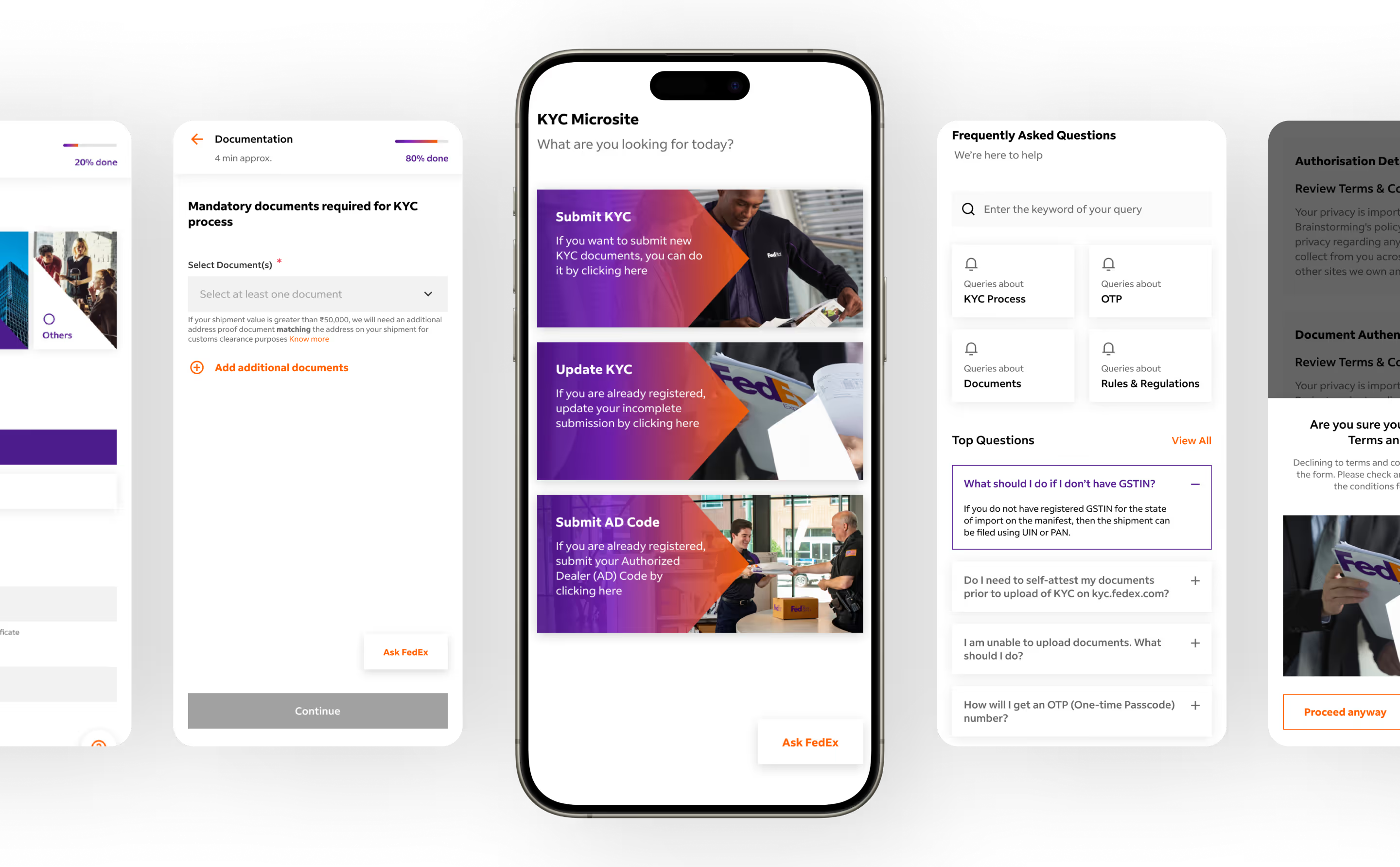
Simplifying User Onboarding for FedEx’s KYC Platform
A responsive web solution to make FedEx’s KYC process easier, faster, and more approachable for individual and business users.

industry
Services Provided
PLATFORMS
BUSINESS TYPE
Overview
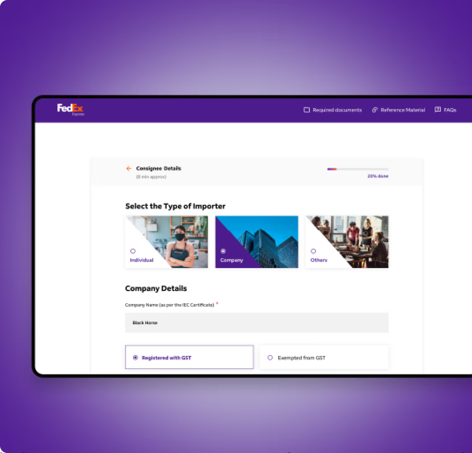
FedEx is a global shipping and logistics brand renowned for efficient shipping and delivery across more than 220 countries. The FedEx KYC microsite enables customers and businesses to register and complete e-KYC processes online.
.avif)
.avif)
.avif)
.avif)
.avif)
.avif)
Streamlining Onboarding
Turning Complex Processes into Simple Journeys
The project aimed to redesign the KYC microsite. The goal was to improve the clarity of registration steps, enhance task completion efficiency, and create a visually engaging interface that reduces friction in completing KYC requirements.
The Method Behind Magic
Our Strategic Design
To ensure a smooth project flow, we adhere to the STEP process, an acronym representing Soak, Think, Execute, and Proof. Beginning with UX Research, the UX design case study progresses to strategy and concludes with impactful UI.
.avif)
.avif)
.avif)
Decoding the Ecosystem
A 360° View
A comprehensive competitive analysis helped us identify gaps in digital onboarding and verification experiences within the logistics and courier ecosystem. Insights were focused on reducing drop-offs and improving task completion.
Clear & Guided Onboarding Journeys
The UX audit revealed friction in the KYC process due to unclear steps and limited progress visibility. Registration and verification flows were restructured to guide users step by step, making the journey feel predictable and easy to complete.
Streamlined Verification & Support Flows
Task flows were refined to help users upload documents, verify details, and move between steps easily. Timely prompts and live guidance surfaced exactly when users needed support.
Smooth Onboarding Build Confidence
Users wanted to understand what steps they would complete before beginning the process.

Visual Clarity Matters
Respondents preferred straightforward layouts that reduced cognitive load.
Simplicity Fosters Trust
A transparent, predictable journey helped users feel confident about sharing their information, which is especially needed on such a platform.
Indirect Competitors
We identified other logistics platforms such as DHL, UPS, and Blue Dart as indirect competitors of FedEx and we gathered a few insights.
- User data is leveraged to simplify onboarding and personalise communication.
- Processes are designed to function reliably even during high-traffic usage.
- Support teams are structured to answer queries across different user touchpoints.
Direct Competitors
Direct competitors included courier and logistics platforms offering similar online KYC and account setup flows.
- Clear step-by-step communication helps users complete verification with confidence.
- Key services and requirements are highlighted early in the journey.
- Transparent information reduces confusion and speeds up decision-making.
Core problems
- Many tools miss emotional engagement, focusing only on routine.
- Users drop off when features feel repetitive or transactional.
- Personal growth feels impersonal without a human touch, like affirmation
Key Opportunities
- Design with empathy, like a coach that understands them
- Introduce gamified incentives that feel rewarding, not forced.
- Use personalisation to build an emotional connection.
- Build trust with transparent data handling
Architecting Experience
Turning Insight to Frameworks
We organised the experience around intuitive navigation, clear hierarchy, and logical wireframes to ensure completion of KYC tasks with minimal confusion.
.avif)
.avif)
.avif)
Our Solution
A Seamless KYC Journey
The redesigned microsite starts with clear onboarding steps and visual cues that help users proceed confidently.
Simplified Technical Language
Simplifies the terminologies to make them easily understandable by laymen and reduce the chances for mistakes.
Faster Support System
Simplified user journey and recommended chatbot and FAQ integration to offer quick and handy answers to user stories.
Form Meets Function
Designing Engaging Interfaces
We created a visual system that reinforced FedEx's trusted brand. For the font, we used FedEx Sans in a variety of bold font types. For the colour palette, we stuck to purple and orange and used gradient colours. Colourful icons were designed, and the text colour was kept neutral in grey and black.
.svg)
.svg)
.svg)
.avif)
Success story
What happens when great design meets real problems? Our projects speak louder than buzzwords.

The team offered effective project management, timely deliveries, and outstanding responsiveness, agility, and creativity.
.avif)
More Like this
.avif)
Stop Guessing. Start Designing
See why we’re not just a UI/UX Design agency; they see us as a strategic partner to their team.

Good design starts with Sliced Newsletter
Subscribe to the Sliced newsletter and get the best of research, UX writing, product psychology, CX, and design systems, right in your inbox.
