Redesigning the Home Furnishing Brand's Digital Platforms
Denkali is a premium & customisable home furnishing brand based in Mumbai. It offers a wide range of products and raw materials, including online furnishing, lighting, and home decor solutions for customers to customise their spaces the way they like.
Reimagining the Home Furniture Buying Experience, One Room at a Time
.avif)


industry

Services Provided

PLATFORMS
Application

BUSINESS TYPE
Overview
Denkali wanted to upgrade the design of its website for both mobile and desktop. The result was aimed at providing a better user experience and making it a premium and dependable space for customers and prospects.
.avif)


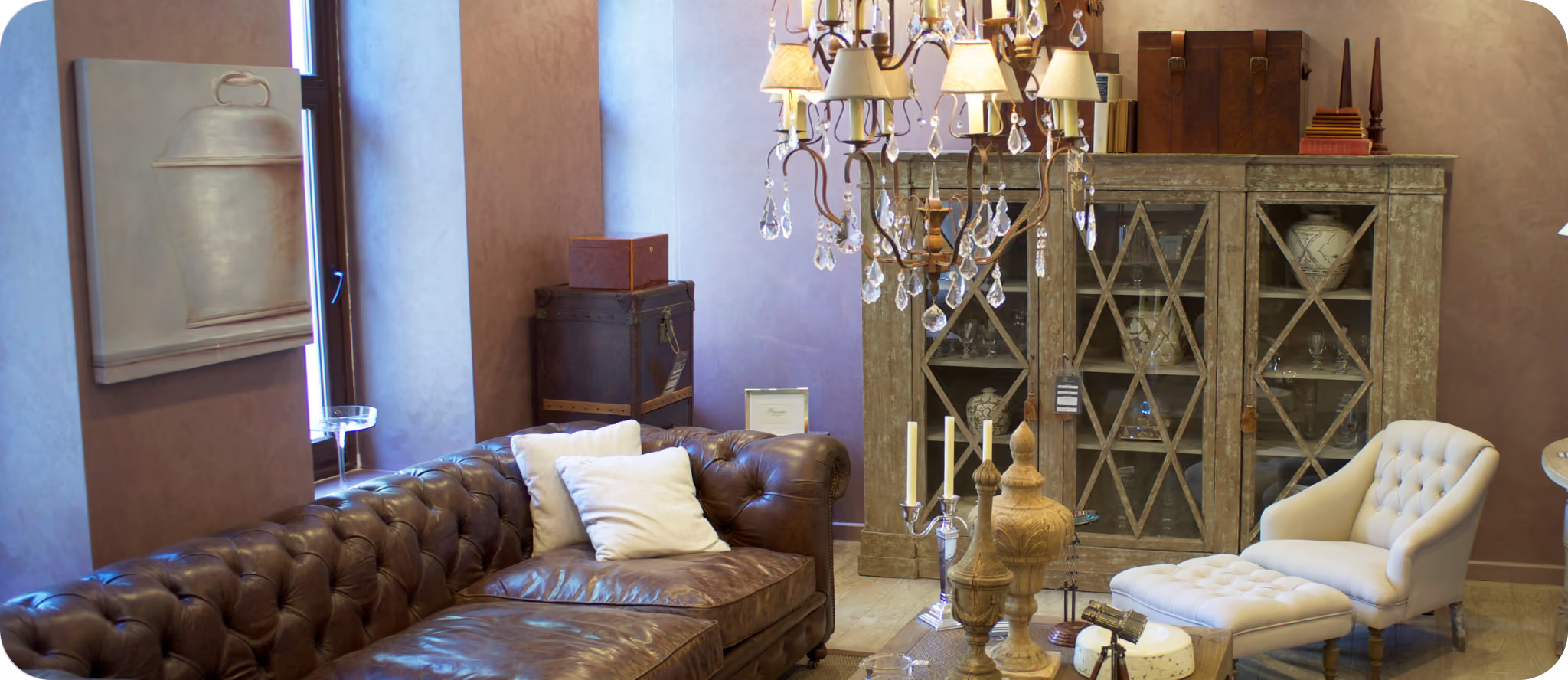

Turning a Cluttered Digital Experience into a Seamless Home Furnishing Journey
Bridging the Gap Between Premium Furniture and Customers
Denkali redesigned its digital presence to improve conversions through a more intuitive and trustworthy user experience. The website simplifies product discovery, showcases tailored interior design solutions, and educates users on configurations and design options to support informed decision-making.
The Method Behind Magic
Our Strategic Design
The project was divided into four phases: UX Research, UX Design, UI Design, and branding. We identified the competitors and recognised ways to position the product. A thorough competitive analysis was conducted to identify the gaps in the user journey. Based on the UX research, user personas were created.


Decoding the Ecosystem
A 360° View
We used a mix of research methods, including user testing, behavioural analysis, affinity mapping, and competitive benchmarking, to understand customer needs and shopping patterns
The findings showed that furniture purchases are largely need-based, with customers preferring to shop with family and buy items gradually. Despite the growth of online brands, physical stores remain important as customers value seeing and experiencing furniture firsthand, while return policies strongly influence purchase decisions.
Missing CTAs
Some important flows, like kitchen selection, are unnecessarily long. CTAs are unclear or missing across product and landing pages.
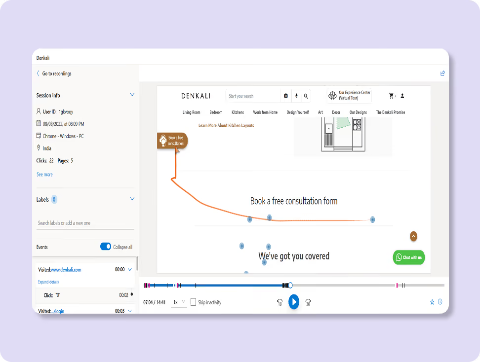
Discoverability and Infrastructure Architecture
Users don’t find the platform to be intuitive because of the lack of breadcrumbs, cluttered experience, and inconsistent UX writing.
.avif)
Compromised Brand Trust
Irrelevant imagery and lengthy UX copy reduce user confidence. Inconsistent fonts, margins, icon styles, and weak brand presence affect overall brand credibility.
.avif)
Unclear Field Entry
Confusing form fields and missing progress indicators lead to a higher drop-off rate.
.avif)
Large furniture, like beds and sofas are purchased once every several years. Whereas smaller items, such as table lamps and chairs, are replaced more frequently.

People have individual tastes, and finding the right design is a challenge. In this case, users get custom-made furniture.
.avif)
Most users shop with an open mind, but almost everyone has a predefined taste, which is usually minimalistic and clean aesthetics.
.avif)
People have individual tastes, and finding the right design is a challenge. In this case, users get custom-made furniture.
.avif)

It boasts an enticing visual appeal by presenting a wide array of furniture options in a visually pleasing manner. Standout features include affordability, making quality home furnishings accessible to a broad audience.
They ensure quality confirmation with both online and offline studio experiences, allowing customers to validate their choices in person.
.avif)
It stands as a globally recognised and trusted brand because of its reliability and quality in home furnishings. Particularly notable for its expertise in crafting designs that maintain a sleek and non-bulky aesthetic, especially for larger furniture pieces.
Core problems
- Denkali, like several other online furniture stores, had lower trust among users. Personalised furniture typically fosters trust and reduces scepticism, especially in online purchases. However, the feature poses difficulties. Additionally, the Call to Action (CTA) was missing in several sections, requiring users to backtrack.
- Lower conversion rates were because of multiple factors, including icons, typography, illustrations, and micro animations, which reduced the overall appeal. Despite error-free content, the imagery did not align with the page's message.
- Difficulty in product discovery due to undefined Call to Action (CTA) points and confusing website navigation, with images covering screens, hindered product discovery.
Key Opportunities
- The visibility of decision-making factors and choices was enhanced on the customisation page. We also implemented a logical flow with proper CTAs to streamline user actions and minimise confusion.
- We incorporated relevant imagery, shorter sentences for better comprehension, and reduced the icon and font sizes for a cleaner look.
- We enhanced the landing page design by implementing more precise CTAs and highlighting navigation sections for users to easily identify their location within the website, improving overall navigation.
Architecting Experience
From Insights to Frameworks
The revamped brand website places greater emphasis on visually representing each product, making it as easy as possible for users to familiarise themselves with it.
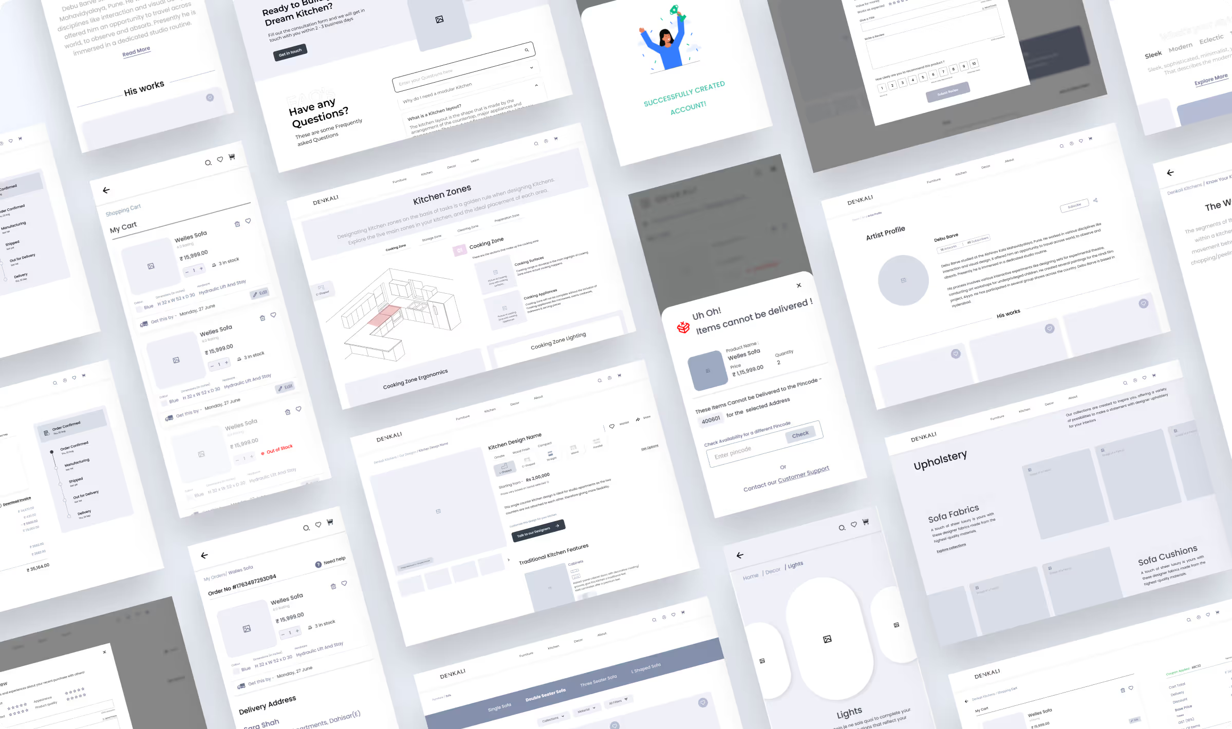
Architecting Experience
From Insights to Frameworks
The platform was redesigned with refined task flows, stronger dashboard logic, and clearer navigation, enabling enterprise teams to manage projects with less friction and greater confidence.

Solution
Made a Compact Menu
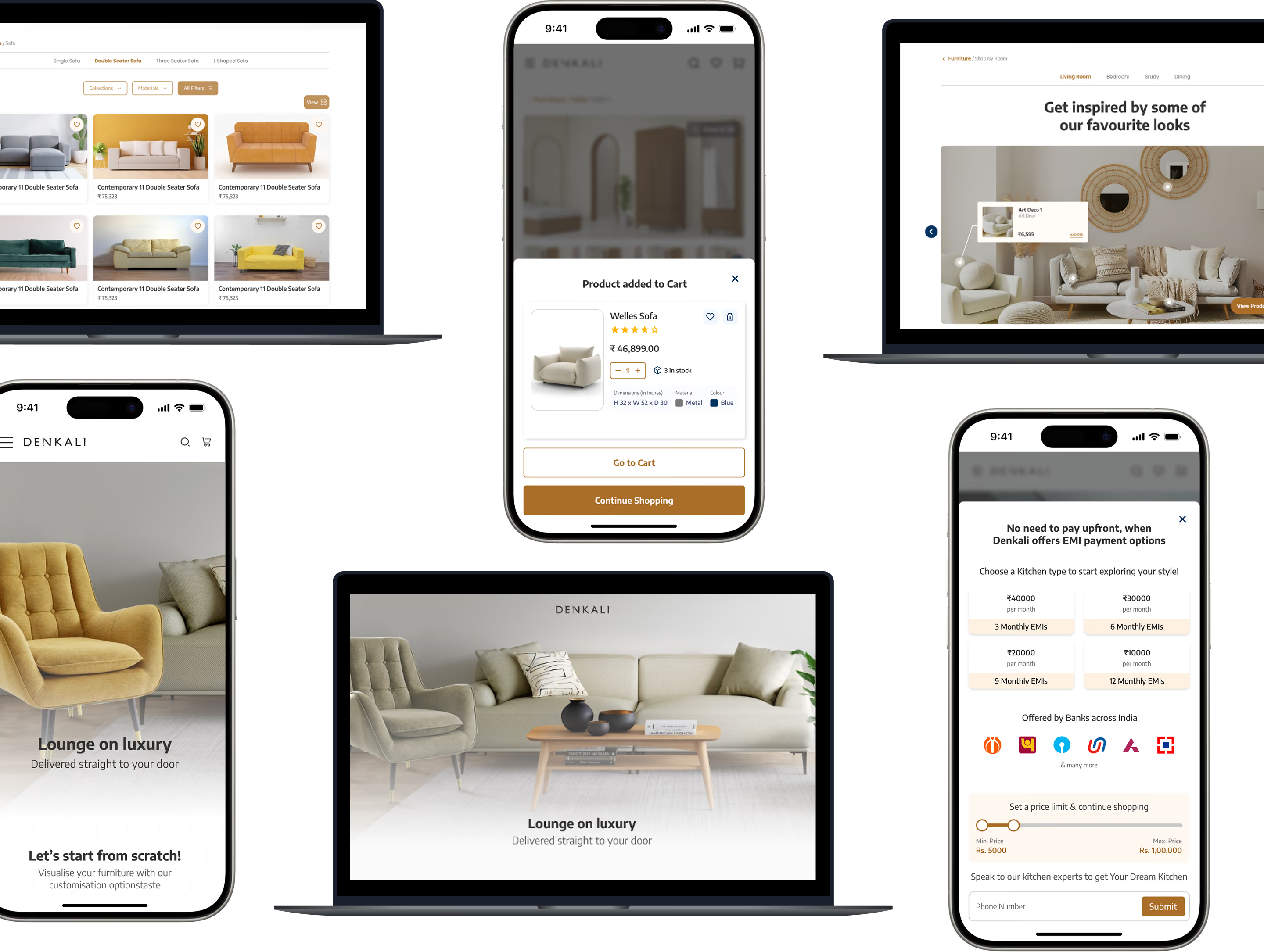
To reduce the overwhelmingly long menu, we created an intuitive navigation flow that enables users to find the products they want easily. Within the megamenu, we strategically used images for every product category that give a visual appeal to the menu, compelling users to click on it.
Redesigned Living Room Page
We also added hotspots on the banner and other images to allow users to see the products visually in a relative setting. Users can quickly get the necessary product details while viewing them in the images with the hover-on-hotspots function.
Simplified product page
For every product page, users receive the option to customise it and a guide on selecting materials, empowering users to make informed decisions. It goes on to build brand trust among its users.
Form Meets Function
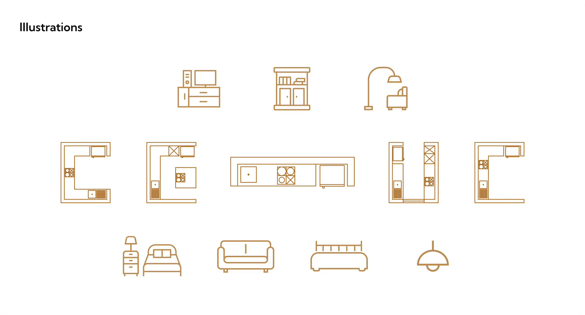
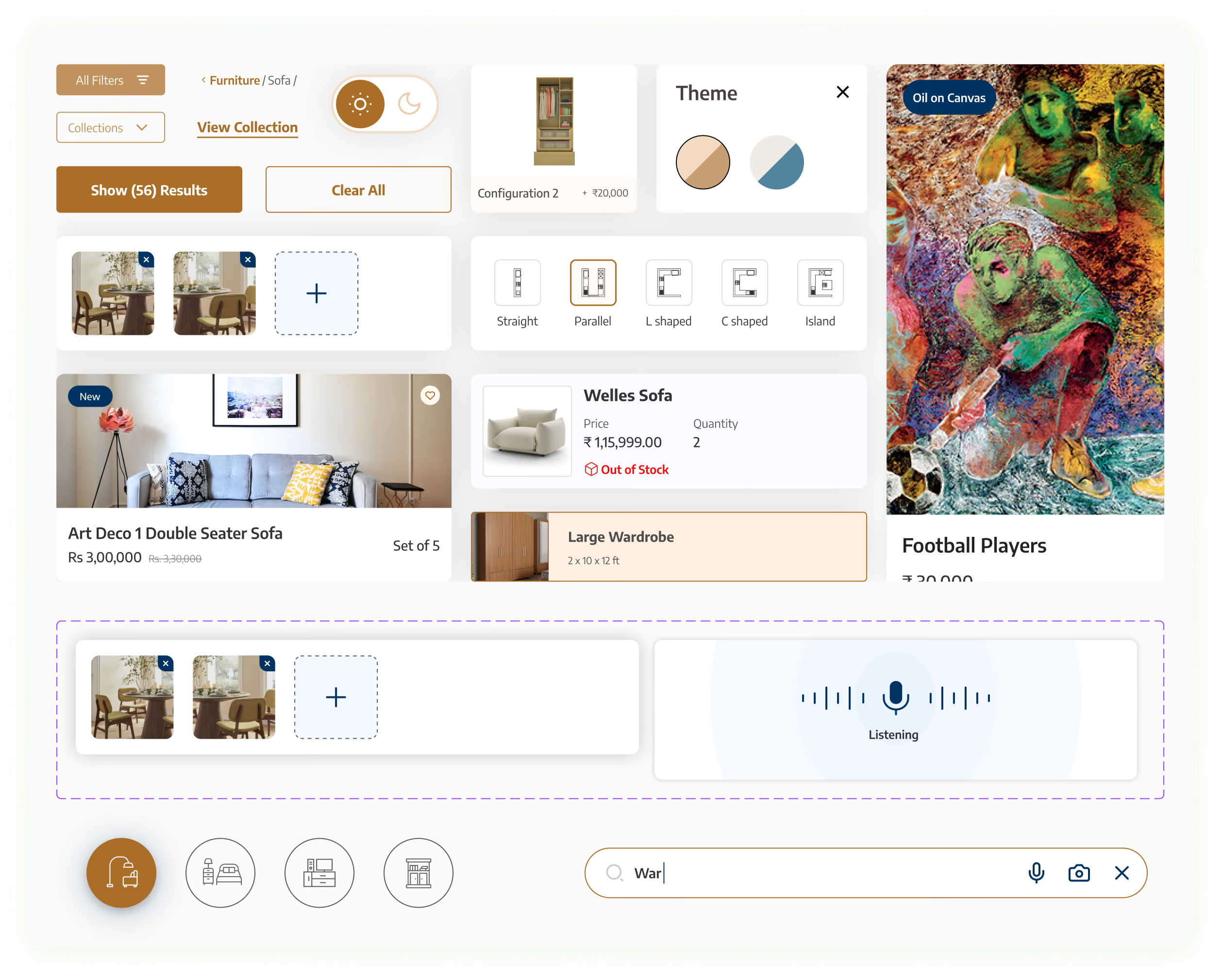
Designing Engaging Interfaces
The project spanned 2 months, and we designed 271 UI screens. For typography, we used the font Encode Sans. For primary colours, we used black, brown, white, and blue. For secondary colours, we used light shades of these four primary colours.
For tertiary colours we used green, orange and red. The test was written in different shades of grey and white.

More Like this
.avif)
Talk to Us Today!
Let’s explore how our creative expertise can transform your product into a human-centric and innovative solution.
Good design starts with Sliced Newsletter
Subscribe to the Sliced newsletter and get the best of research, UX writing, product psychology, CX, and design systems, right in your inbox.