4 Common UX Pitfalls in Fintech and How to Avoid Them

Soumyadeep Auddy
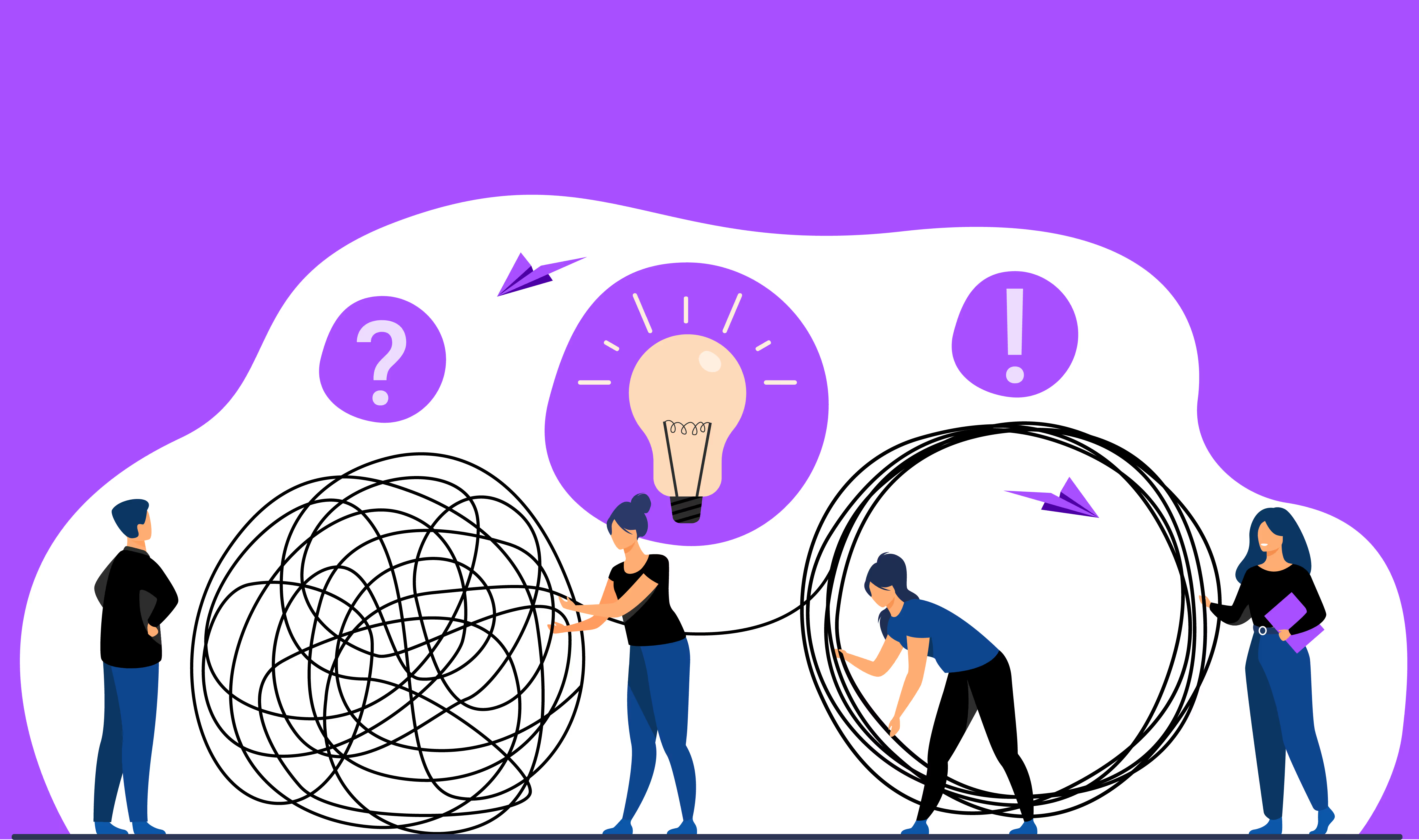
Fintech apps have revolutionized the way we manage our finances. Nowadays, people dont need to visit a bank branch to transfer money, track spending, invest, or even get a loan. With just a smartphone, you can do all these things using budgeting tools, crypto wallets, and investment platforms. These apps are attractive, modern, and easy to use. But is this it? Of course not! There is a lot more going on behind the scenes.Fintech creates attractive apps, builds products that are safe, secure, and legally compliant, and makes it easy to access. However, think if your fintech app messes up a little just because of a glitch, someone might lose their savings or get delayed in payments, or might your data get exposed. Thats serious, right? Thats the reason usability in fintech applications is necessary.So, where do things go wrong? Why does it happen? Whats the solution? Lets explore the biggest UX mistakes fintech products make and how to fix them.
Why Fintech UX Must be Flawless?
Let's understand the reality of most people. Generally, we were not taught to read a bank statement about investment reports in school. Money can be a big task to handle, and it can be confusing too while investing. Thats exactly where many fintech apps go wrong.Common fintech UX issues often happen because either the apps are too complicated to understand or have confusing navigation. Many companies focus on adding features, but do they help? They forget people are already dealing with their finances, like how to save them or where to invest.Designing an app is not just about the look, but is about giving clarity. However, designers working on fintech apps face serious challenges, such as:
- Verifying user identities(KYC)
- Keeping personal and financial data safe.
- Following strict financial rules and regulations according to every countrys financial law
- Earning and keeping users trust.
All of the above challenges will affect how the app looks, works, and feels to the user.Thats why UX pitfalls in fintech are more dangerous than in other industries. A confusing button, a missing message, or a poorly timed alert can lead to problems like lost money or missed transactions. The usability in fintech applications is important as its about protecting their data, money, and their confidence.
UX Pitfalls in Fintech
Over-complicated Onboarding:

Onboarding is the main challenge for fintech apps. Shockingly, more than 60% of users abandon the sign-up process before they even finish. Fintech in Europe loses 5.7billion euros each year due to incomplete onboarding. Why does this happen? Fintech must collect personal info, perform ID checks, verify faces, and scan documents, and that cant be changed. What to do then?Lets try to do a bit of transformation for a better user experience:
- Break into small steps, making it easier to understand. One step at a time makes it easier to understand for a wide audience.
- Show some creative buttons once you achieve a step. This will improve user engagement.
- A save & continue later button saves a lot of frustration. It helps people to take a break and resume onboarding.
- Give a clear explanation of how you will protect their account. According to a survey, 92% of users worry about data usage; an explanation will do the work.
Improving onboarding helps users to look forward to digital banking, encouraging them towards fintech features. It also helps boost revenue, trust, and brand loyalty.
Rough Verification and Security:
We all know the importance of passwords, two-step verification, or identity checks; however, poorly designed apps feel like a punishment while going through fintech security features.Poorly designed experiences have become one of the most disappointing UX pitfalls in fintech into a deal-breaker. It is necessary to design the app in such a way that it will not feel like a hurdle.Here are some ways to improve user experience:
- Use smart password meters like emojis or some other signs to boost user interest while setting a password.
- Set different verification methods, such as for everyday users a face verification or a password, and for higher limits, add documents and other necessary steps. This will help users to visit every day without any disturbance, increasing engagement.
- Frame their journey with encouraging words such as Youre one step away or Youre almost done; this builds confidence and not frustration.
- Use risk-based Two Factor Authentication(2FA), when the system says something seems off, is often seen as fairer and praised, whereas always requiring 2FA is a tiresome process.
Fintech UX isnt all about following rules; its about designing in such a way that users feel secure, understand why measures are needed, and trust the app at every step, navigating users through a seamless journey.
Multiple Options-
When your fintech app throws a buffet of options at users like loan calculators, crypto wallets, bill payments, and saving tools, they may feel lost instead of being encouraged. Offering a lot of features can make a product look impressive, and its also good to get everything at your fingertips. Yet, clear navigation is important in any fintech app; to get customer trust and loyalty, the app must be easier, and the action buttons must be transparent.This is one of the most common fintech UX issues: mistaking quantity for quality. This might confuse the users about where to begin and what to choose, it will stress out the customers, and will cause drop-offs. Well, no problem, here are some solutions that can help avoid these issues:
- Guide users with a dashboard that has buttons that matter the most.
- Personalize users' choices while choosing the features for the front page.
- Help users make decisions, offer recommendations like Next Step or Next Page.
- Make users familiar with the app by adding more buttons from time to time.
A user-focused experience leads to better engagement, stronger comebacks, and improved usability in fintech applications.
Making Finances Boring:
Why does managing money feel complicated and boring? Most of the fintech apps offer straightforward and boring features with age-old designs and outlook. People need some enjoyable experiences to improve user engagement.Gamification is the best thing fintech apps can do to improve user experience. Adding points, badges, or challenges can transform fintech apps, making customer interactions interesting and improving brand loyalty. According to a survey, 89% of people say that theyd spend more time using an app with game-like elements, improving user engagement.Here are a few tips to spice up your fintech app experience:
- Reward Users for hitting a saving goal or completing a task; this will add motivation.
- Add Challenges and Progress bars or levels to engage users with daily tasks, which will help to make it enjoyable every day.
- Leaderboard and Social Sharing improve user signups by 40% according to the MoldStud website, published on 1st November,2004.
- Turn achieving milestones or investment plans into colorful busts or charts that feel like achievements.
Build your fintech money-making apps filled with excitement and easy to use, it will stand out in the crowd and build trust, and earn loyalty.Fintech UX is a world that is real and often complex. From a confusing onboarding process to jargon-filled interfaces, the pitfalls are real and often messy. Every time fintech makes a process easier, explains something clearly, or helps users feel safe, it helps people take control of their money.If you want to create better fintech experiences, start avoiding the common mistakes.Need help to build a better UX for a Fintech platform? YellowSlice can help you with designs that feel fun and work like finance. Lets connect now.
FAQs about 4 Common UX Pitfalls in Fintechand How to Avoid Them
1. What is the importance of UX in fintech apps?
Fintech apps are dealing with money, and any confusion or misleading information can lead to loose trust and drop-offs.
2. What are the most common fintech UX mistakes?
Complicated onboarding, confusing financial terms, poor security flow, and too many features at once.
3. How to improve onboarding for a fintech app?
Break it into steps, use progress bars, and explain each step; keep it short and user-friendly, improving user experience.
4.How to make security user-friendly?
Use smart password checks for everyday use and put document verification for deeper work, making safety feel smooth and easy.


Let's create something amazing!
Let's discuss your vision and how we can bring it to life with impactful design solutions.
.avif)
Good design starts with Sliced Newsletter
Subscribe to the Sliced newsletter and get the best of research, UX writing, product psychology, CX, and design systems, right in your inbox.
