UX Design Psychology Tips: Leveraging Psychological Principles for Better User Experiences
Ritika Singh
UI and UX designers are always looking for additional skills to learn. Should they learn coding and UX writing or better understand business-like stakeholders? If they know these skills, they will undoubtedly expand their skill set, but their existing design skills will not improve as much.So what should they do instead?Designers of customer-focused digital products should learn psychology, as it would help immensely in understanding human behaviour and designing for it.Users are human, so it only makes sense to combine technology and psychology. Many psychological principles seem simple, but they considerably impact design. Incorporating psychological principles in the UX design enhances usability, improves user satisfaction, and increases engagement.We at Yellow Slice have been following a four-stage process for nearly two decades, which we call STEP (Soak, Think, Execute, and Proof). The four stages are further divided into a seven-step process that we swear by, as it has delivered fantastic results in the past with brands that can vouch for us.Ishwari Kaisare is a senior designer at Yellow Slice who shared her views regarding the relationship between psychology and UX design."Excellent UX design isn't just about aestheticsit's about understanding human psychology. Using cognitive principles creates intuitive, delightful experiences that feel second nature to users."This blog covers different psychological principles and their real-world applications in UX design. We provide actionable insights to help you improve your UX design.
Psychological Principles for UX Design
The intersection of psychology and design is extensive. We can go on and on about which psychological principles impact design, but here, we mention a few that are more commonly used.
Decision-Making and Simplicity
Psychology principles such as Hicks law are used to ease the decision-making of the user and to design simple interfaces,
Hicks Law
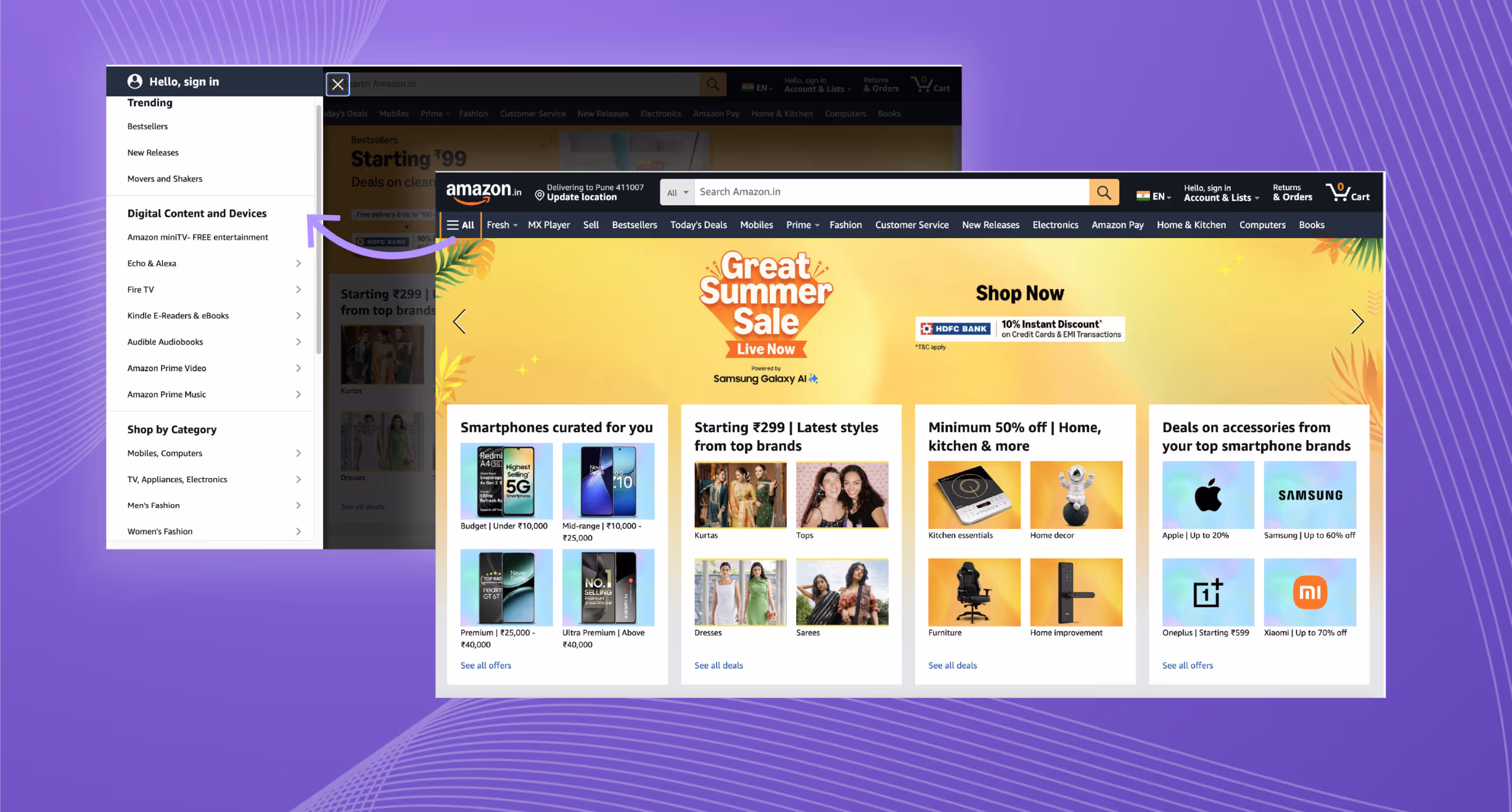
If we presented you with a cup of ice cream, you would just indulge in it. But if we asked you to choose a flavour of ice cream from the list of 20 flavours, wouldnt it be challenging to pick one? It even gets worse if youre a little indecisive. You would take some time to decide, and your taste buds would have to wait.This is Hicks law, or the Hick-Hyman Law, which was named after two psychologists, William Edmund Hick and Ray Hyman. The law states that the more choices a person is presented with, the longer the person will take to decide.Hick Law frequently finds its application in user experience (UX) design, with a view that designers shouldnt provide too many choices/information to the users on their interface as it may confuse them and delay conversion time.Its important to focus only on the primary elements so that users know exactly what action to take. This doesnt overwhelm the users, reduces their decision-making time, and keeps them engaged.The formula for Hicks Law is as follows:RT = a + b log2 (n)Where RT is the reaction time(n) is the number of stimuli presenta and b are arbitrary measurable constants.Usually, how the Hick Law works is: to reduce the number of stimuli (choices) and get user decisions input quickly. However, remember that this is not a hard and fast rule that applies to all the instances, and this has exceptions.Compromises need to be made with Hicks Law when theres no way to avoid the complexity of choices. For instance, a DSLR will have more options than a smartphone camera because you cannot eliminate the process just to simplify decision-making.Application: Most users who visit your website will eventually land on the landing page, which will probably be the first glimpse of your business for some. Hence, it is essential to make this section direct and with fewer choices. Introduce your company and highlight the USP of your product or service.Users see before reading anything, so grab their attention with a well-placed image and make every element count.Real-World Example: Amazon has a shop-by-category option visible on the website. However, Amazon still focuses primarily on the search button so that it is easy for users to find just what they need. The list of departments is pretty long, but its still scannable.Imagine you were looking for a last-minute birthday gift for your best friend. You had to scroll through thousands of choices that would appear on the Amazon homepage if the designers didnt try to incorporate Hicks law into the UI and UX design.
Visual Perception and Organization
How to visually organise content so that it leaves an impact on the users and their perception of the digital product: Read about the psychological principles mentioned below to understand better.
Gestalt Principles
Gestalt principles explain laws of human perception that describe how humans group similar elements. These principles help form a pattern so that designers can use that pattern to take advantage of it and create user-centred UX designs based on those patterns. This way, user navigation becomes natural and easy to flow.Gestalt is a German word meaning unified whole." In the 1920s, German psychologists Max Wertheimer, Kurt Koffka, and Wolfgang Kohler created the Gestalt Principles.These principles then addressed peoples natural compulsion to find order in disorder. Graphic designers took advantage of this, creating eye-catching designs and placing those elements correctly on the interface.There are more than ten principles, but here we discuss the most common ones that designers usually use while designing the UI of digital products.Emergence: Do you remember the Unilever logo? Have a look at it here,
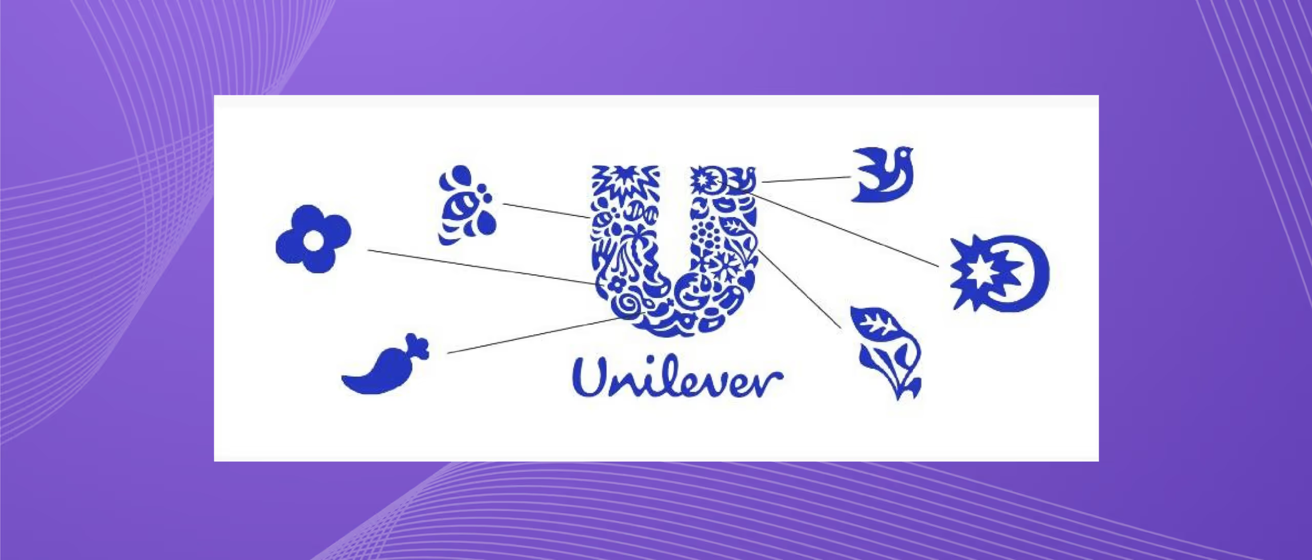
It consists of several small shapes, and the combination of these small shapes constitutes the letter U. Looking further, we see many smaller icons emerge from these abstract shapes. Instead of interpreting each small shape, our eyes immediately identify the letter U.We perceive the world without thinking too much about understanding every small thing that surrounds us.Closure: Our eyes complete incomplete images. We prefer filling the gaps between elements to perceive a complete image because our eyes like to see a whole picture.Designers use close creativity to gain users' trust so that they can see a complete picture themselves. Cleverly placed lines, dots or shapes that are not completely whole but appear whole to the eyes are pleasing. For instance, look at the IBM and World Wildlife Fund (WWF) logo here,

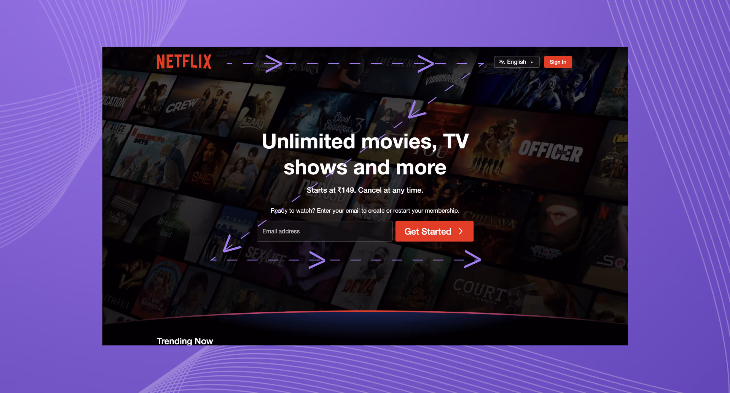
Continuity or Continuation: The continuity principle of Gestalt refers to human group elements that seem to follow a continuous path in a particular direction. The human eye follows a design's path, line, pattern, and curves and prefers to stay in the constant flow of visual elements rather than separate elements.The human eye is psychologically trained to follow a continuous path even if an obstacle hides it or some element breaks the flow through an intersection or bisection. For instance, Netflix uses a Z pattern to place the elements on its homepage. The logo is in the left top corner, the sign-in option is in the right top corner, the Email address slot is on the left side, and the red get started toggle is on the left. This placement forms a Z pattern that is natural for the eyes to follow.
The Law of Pragnanz: Also known as the principle of simplicity, this law states how humans process visual information. People usually perceive complex things as simplified forms to quickly recognise and understand what they see.Pragnanz is a German word that means salience, conciseness, and orderliness. The law of Pragnanz is a guiding principle for visual perception. When users see highly complex shapes, they simplify them by removing excess detail to make a unified whole.When we look at this image, our eyes automatically make sense of the design, and we see black-and-white hands.

There are other Gestalt principles, but lets save them for another day.
The Von Restorff Effect:
The Von Restorff effect, or the isolation effect, is a psychological principle and a UX law. When you look at a digital product, your attention is drawn to something particular. The reason for it to pop out can be its vibrant colour, unique font, or some other property of that particular element.These elements will compel users to take the desired action. Chances are you will remember this element for a long time; thats our minds' tendency. This effect highlights the importance of distinctiveness in memory formation and recall.The Von Restorff Effect was coined by German psychologist Hedwig Von Restorff in 1933. By this point, dont you think Germans should also leave a concept or two for other nations? Jokes aside, this effect can be applied in different ways, such as in Calls to Action, form fields, progress indicators, etc.This reduces the users' cognitive load so that they can see what matters on the screen. They dont have to pressure their minds to find the desired action on the screen.Real-World Example: Remember the last time you searched for a LinkedIn job? The Apply toggle can be noticed from afar, and its the first thing you usually see on the web page. Whys that? Thats the Von Restorff Effect in action. The apply button uses a bold blue colour, contrasting with the plain white background.
Attention and Memory
What draws users' attention to something, and why do they selectively remember some information while forgetting others? Read on to learn these psychological principles so that your digital products can leave a mark on users' memories.Serial Position Effect:If youve ever created a to-do list to finish your chores, youll agree that you remember the first and the last thing on it very clearly. The ones in the middle fail to stay in your memory for a long time. But whys that? This is because of a phenomenon called the serial position effect. This cognitive bias explains how an item's position in a sequence affects how well we can recall it. German psychologist Hermann Ebbinghaus first identified this interesting psychological effect in the late 19th century.This phenomenon consists of two key components:Primary Effect: When we read a book in school, we know the first chapter by heart because its human tendency to remember the first items in the list better due to frequent rehearsal and long-term memory encoding.Recency Effect: We used to remember the book's last chapter because we read it last, and it remained in our short-term memory. In short-term memory, items are still fresh in our minds, making them more accessible; hence, recalling when required is easier.Real World Example: High-priority elements should be placed at the start and end of the onboarding flow. In onboarding flows, apps like Duolingo and Notion introduce key features at the beginning so that users reinforce them at the end to ensure they remember essential functions.E-commerce companies like Amazon display the Add to cart and Buy Now buttons at the top of the webpage and reiterate them at the bottom for maximum visibility. Users naturally engage with elements in these positions, leading to higher click-through rates (CTR).Millers Law (Chunking):Millers Law predicts that average people can only keep 7 (+2) items in their working memory. Cognitive psychologist George Miller first discussed this in a 1956 paper, discussing the limitations of short-term memory and memory span. This is a much-debated concept, and there have been many misinterpretations about this heuristic over the years. Have you heard about the magical number seven? This phenomenon has led to it, too, and its been used wrongfully since then. For instance, limiting interface menus to no more than seven items. Also known as Chunking, thanks to Millers fascination with chunking and our ability to memorise information accordingly, chunking is used to visually group related information into small and distinct units of information when applied to UX design.Quick Activity: Try to recite your moms phone numberReal World Example: Users easily comprehend information in smaller chunks. For insurance, phone numbers are usually grouped, as shown here. Long strings of digits are more complex to remember, but when divided by brackets and hyphens, they become more scannable, readable, and easy to recall.

Challenges and Considerations of Integrating Psychology into UX Design
What challenges will arise when applying psychological principles to the design, and what should be considered while doing so?
Ethical Concerns
Everybody is concerned with the number of hours they spend on Instagram; the doom scrolling has to stop. The designer has nailed the infinite scroll feature, but is it helping the well-being of users or manipulating users into practising habits that are unhealthy for them?Designers should focus on enhancing user experience, not manipulating user psychology to benefit themselves.
Cultural Differences
Most human psychology is universal, but there are nuances everywhere. Users' psychology changes with changing cultures and geographical locations across various demographics. Hence, remember the culture and the part of the globe you are catering to.For instance, in colour psychology, white symbolises purity in Western cultures. In contrast, it represents mourning in Asian cultures.
How Yellow Slice Helped MLA Rare Medium to Ace their UX Design
MLA - Rare Medium is an import and export organisation for red meat and liver in Australia, providing meat, beef, etc, to exporters and licenses to traders across the globe.The Problem: Executives of MLA Rare Medium approached Yellow Slice designers to revamp their digital products: mobile app and website. They also wanted a wholly changed rebranding. They asked for a simplified user interface to make it more user-friendly and faster. For different products, they wanted to designate distinct brand colours for each product for clear differentiation.The Solution: We designed the UI of this B2C brand and made it more modern, simple, clear, and faster. UI mood boards and UI samples were created to set the theme of the entire application. After client approval, UI screens were made for the application. Everything from the font family to the colour palette and icons designed were planned out.
Experience Slice of Designing at Yellow Slice?
Having worked with big names like Make My Trip, NPCI, Axis Bank, and Croma (and the list is long), we have picked up the best UX design practices. We take pride in advancing the human experience and deriving results for business with intuitions and facts.Ready to get a slice of digital experience? Visit our service page, and lets start designing your success today.

FAQs
1. What soft skills should I master as a UI and UX designer?
Understanding human psychology helps create user-centred designs that align with human natural behaviour and cognitive processes. For instance, Gestalt principles like proximity, similarity, and continuity help designers group related elements.Other principles, such as cognitive load theory, preach the minimisation of mental effort in complex interfaces so that users dont have to go out of their way to understand how to work with a digital product.
2. How do psychological triggers like social proof and reciprocity influence UX design?
Social proof is a way for users to believe that if other people use a particular product or service, there must be something worth trying. This builds user engagement and trust, as people mostly follow the actions of others, incredibly when uncertain.Conversely, reciprocity is based on the principle that people feel obligated to return a favour. Users given something for free, like a downloadable resource, will likely return to purchase your business.

Let's create something amazing!
Let's discuss your vision and how we can bring it to life with impactful design solutions.
.avif)
Good design starts with Sliced Newsletter
Subscribe to the Sliced newsletter and get the best of research, UX writing, product psychology, CX, and design systems, right in your inbox.
