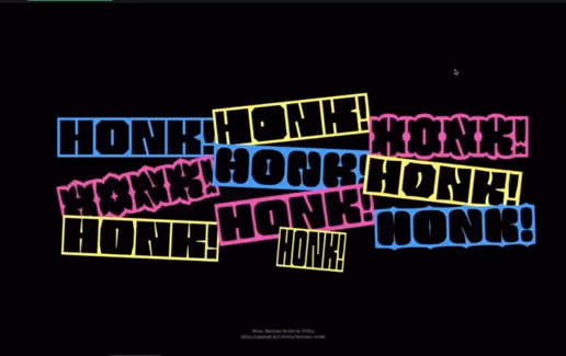
Typography In Design: Designing in Multiscript Country

Kishor Fogla
Have you ever wondered about the concept of language in design? As an English speaker, are you curious how words would change when translated into Arabic or Japanese? Or, as a Malayalam speaker, are UX Copies translated to convey the depth of the meaning to users?Lets skip the semantics and focus on how different signs, symbols, and letters change the meaning of a design. As designers, we need to be conscious of every stroke and dot in a design. We ought to learn how to manoeuvre language(alphabets, signs or symbols) to the best of our ability in every design.
Sarang Kulkarni: A typography Guru.
It is imperative that we give honour to whom it is due. So we doff our hats to Sarang, who introduced himself to us with such humility. He grew up in a small village in Nagpur and specifically talked about a beautiful river. It is interesting how something in our environment can be a source of inspiration that we hold on to for life.Never underestimate your creativity in relation to your natural environment!Moving on to his learning phase, he went to Sir J J Institute of Applied Art to earn a degree in Fine Arts. It is noteworthy that this was where his design journey started. He told us about a series of assignments and projects where he had to do some nature drawings, 2D, 3D, and product designs.You might not need a degree to get a Job, but you definitely need the degree experience at some point in your career!He seems to have a clear idea of what hes interested in. After freelancing for almost a year, he started a design studio to give his freelancing service a professional look. His services centred on typography and typefaces. When he started, he told us that it was difficult to get people who wanted typeface design, so he had to switch to graphic and brand identity design.Always be flexible to fit the market and users.In a bid for more visibility, he had to restructure and separate type design from graphic design. This led to the birth of Ek Type in 2010. So we have Sarang as the founder of Ek Type and White Crow. He has also contributed to digitalizing Indian script, calligraphy and typography by actively contributing to Aksharaya society.
Typefaces in the Indian Market
Sarang continued his conversation with an observation about Indian signage being bilingual or even trilingual. For a country as big as India to capture people's attention, you need to meet them at their most basic state: cultural identity and symbols.
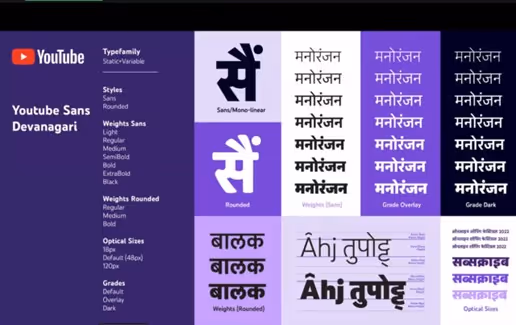
He further showed how this has expanded to digital applications, as many apps now incorporate Indian languages to reach more people. He gave statistics on the OTT Platform based on subscriptions. He was surprised to see Hotstar and Jio taking the majority of the market shares when Netflix and other American OTT Platforms were in existence.He showed us slides of Tamil, Hindi, and English scripts and pointed out that there are many language mistakes when trying to fit the scripts into contemporary designs. This is why typefaces and typography should be prioritized. He pointed out that there is no structure, so there is no enabling environment to play around and innovate with the fonts of Indian languages.He showed us instances of airport signals, popular apps, and even government websites where the scripts are altered to fit the design. In short, the crippling effect is that the regional languages for most of the applications that try to be inclusive are not as inclusive as we think. The reason is not far-fetched- the templates are not designed for the Indian market.To keep your attention, Sarang pointed out that there are issues with designing characters for multiple scripts and picking the wrong conjunctions. He narrated an incident where he was supposed to create a logo for Sprite for Bangladeshi audiences, and there was a regulation that had to be designed in Bangla script.The agency he was designing for said that the S is not visible enough in the Bangla script. So they asked him to make an uppercase S, which is not as easy as it seems. He got creative by mixing English and Bangla, which made more sense.Imagine a newbie typeface designer in such a situation. How would they have handled such issues?
How to Design for MultiScript Project
Sarang's starting approach is to understand the idea behind creating a font family. The purpose of the scripts is to set the parameters for other elements when designing them.Once the height, weight, and other details are in place, the next step is to make a sketch before digitizing it. This is pretty similar to a lo-fi wireframe, and it just shows the importance of lo-fi wireframing.
The next step is to select your software, and he recommends Glyph and Font Lab. As a designer, your design tool should aid your creativity. Pick one and get so good with it.He explained that he starts with important letters before the basics. Then, they move on to numbers, characters, and conjunctions. Designing might not be restrictive, but there should be a methodology to guide you.One would think iteration is only for product design. Sarang talked about what is similar to going over the scripts; he described it as moving two steps forward and one step backward. But then, he acknowledged that the back and forths might create some sort of complexity. This is why iterations in UX Design should be done carefully.Finally, he stressed the importance of the elements in making each stroke, dot, curve, etc. A little too thin or a little too thick can change the meaning of these fonts when they are used and stretched, making them difficult for an average user to read.Does this ring a bell about consistency and minimalism?
Question and Answer
He closed his discussion by showing us a couple of video examples. You can catch a glimpse here.Yellow Insights does not end without an interactive session. It started with a light question.
Kishor: How many languages and scripts can you personally write?
Sarang: Okay, so I speak and write Devanagari, which is Hindi. I also write in Marathi, Latin, English, and Gujarati. I can read Gurumukhi, which is similar to Punjabi, and I can read Bengali to an extent.
Kishor: When we design logos, we barely consider that they have to be translated into other languages. Now that we are looking at adopting them, when do we need the service of you guystypeface designers? Is it before the design or after?
Sarang: I suggest sharing the process with us so we can point out potential problems and fix them or look for alternatives. However, if the project is completed, we just have to resolve the problem arising from translating the logo.For example, the Vodafone logo has eight (8) letters, but when it was translated to Tamil, Kannada, or Malayalam, it became twice the length of the English character.The agency did not want this, so we requested logos in other countries. We got the one in South Korea, which was just two(2) characters. We had to explain to them that we could not make it big or small; it had to be the way it was.
How do you make sure that your font is not the same as an existing font?
Sarang: We research and Study. We keep an eye on what is happening in the field; who is releasing the fonts? What are the styles? We go to libraries, take pictures and documentation, and ask people around. So, we make sure that we study what people have done and what we are creating to rule out any similarities.There are chances sometimes it will be similar, but we make sure that we know what we have done so that we are answerable for what we are designing.
Just a follow-up to that. Is there any tool that can test whether a font already exists?
Sarang: It is quite difficult for Indian languages. We dont have many fonts in our languages, and most of the designs are used for printed works. So we just do our own local research to make sure that what we have done is not already done.
Neha: How can typography help when the volume of written content has to be reduced without losing its meaning and depth?
Sarang: You can reduce the font size, line spacing, and other elements for the English language, but this doesn't work for other languages. I suggest that designers make flexible templates for these scripts so they can be easily manipulated.Another thing we are overlooking is respect for the uniqueness of each language. We do not have to box a language into the confines of the English language. We just need to accept that this is how the language is supposed to be.
Conclusion
The session was eye-opening, revealing the world of culture, art, technology, and users. We learnt so much about typefaces and how to add or remove them in design. We carry this knowledge forward to our work or personal lives and make the best of it.

Let's create something amazing!
Let's discuss your vision and how we can bring it to life with impactful design solutions.
.avif)
Good design starts with Sliced Newsletter
Subscribe to the Sliced newsletter and get the best of research, UX writing, product psychology, CX, and design systems, right in your inbox.
