11 Essential UI Design Patterns for Crafting Modern User Interfaces
Ritika Singh
UI design patterns are reusable/recurring components that designers use to solve common problems in user interface design. For instance, when you see a form or input field on a website or app, you intuitively know that you must fill it in to use the product. This is an example of a UI design pattern.Imagine you open a restaurant, and you have to build all the recipes from scratch. Sounds like a tiresome process. However, if you have a rough idea of what taste customers like, you can follow that pattern to satisfy them. Consider UI design patterns as a ready-made recipe thats universally accepted.Following set UI design patterns is magic, as they bring consistency to every click, enhance usability in every action, and make the product's scalability seamless.We at Yellow Slice have been following a four-stage process for nearly two decades, which we call STEP (Soak, Think, Execute, and Proof) for designing UX design. The four stages are further divided into a seven-step process that we swear by, as it has delivered fantastic results in the past with brands that can vouch for us.
The 11 Must-Have UI Design Patterns
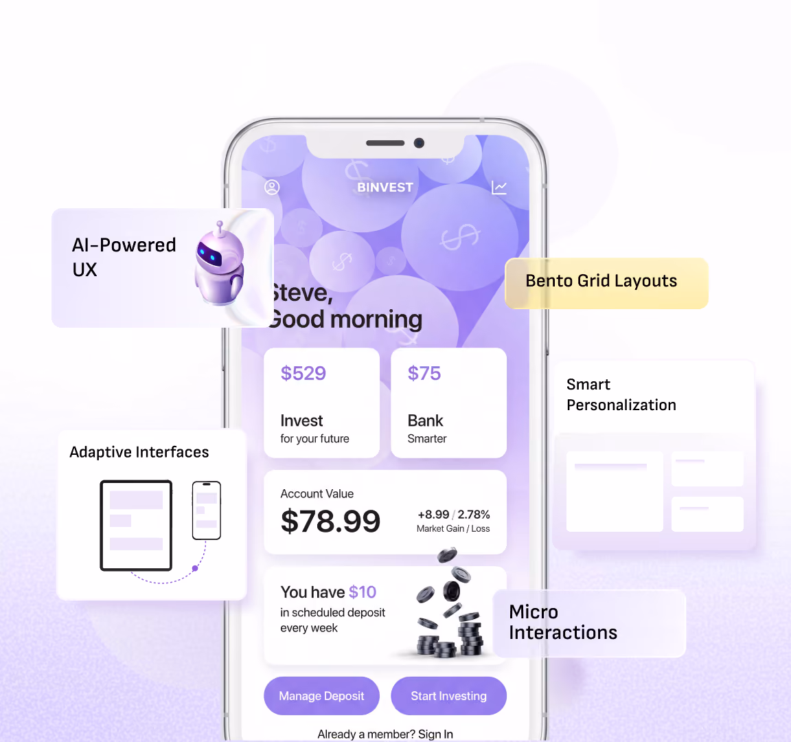
The 11 Must-Have UI Design PatternsUI design patterns serve as blueprints, allowing designers to solve problems that users usually face. Out of many UI design patterns, we mention the most important ones so you dont make common mistakes.
1. Navigation Menus
You must have seen navigation menus, which are lists of links that help users navigate a website by pointing to critical areas. They are usually displayed as a horizontal or vertical bar at the top of each page. Top bars, dropdown menus, sidebars, and hamburger menus are some examples of navigation menus.
Why navigation menus are essential?
- Work as maps that guide users on how and where to find what information/features.
- Use UI patterns such as links, labels, and other elements to facilitate easier interactions.
- Help users with a disability to use your product supporting accessibility and broadening the user base.
- Upgrade SEO ranking as menus help search engines understand websites better.
Design patterns of Navigation menus
- Top Bars, also known as Nav bars and menu bars, appear at the top of a website, as the name suggests. This works best for websites that have fewer features.
- Dropdown Menus keep similar items organized together so that users dont have to scroll through the website.
- Sidebars appear as columns on the side of the interface on complex websites.
- Hamburger Menus are the three horizontal lines stacked on each other that you see on a website that give the appearance of a hamburger. When clicked, the menu slides out from the side of the screen to reveal different options.
Real-life Application
- PhonePes website has a top bar that lists all the necessary places on the website.
- The University of North Carolina's website employs the efficient use of sidebars.
2. Search and Filters
Imagine navigating a website without the search option, filters, and facets to find what youre looking for in a pool of products. Without filters, it will take users a lifetime to find the product and start looking on a different platform.
Tips for making filters
- Make filters that are relevant to your business segment.
- Follow common design patterns according to industry standards so that users intuitively know which filter is for what category.
- Many websites do not incorporate the bestseller filter, which shows that products are sorted by user popularity.
Real-life Application
Amazons website uses several filters and a search option. Without it, one cant imagine digging for the exact product from the gazillion of products Amazon offers.Netflix also has a search option where users can look for a particular TV show or movie, filtering through genres or the actor'sname.These e-commerce and media websites spend a lot of money to create product and service categories. This delivers a fast, relevant, and reliable search experience to users.
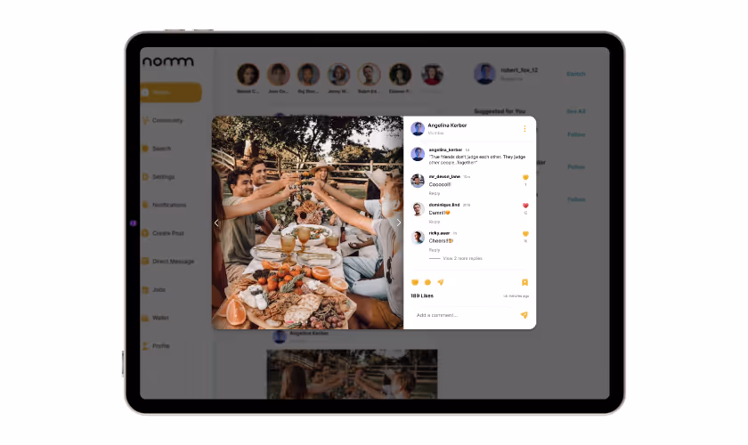
3. Card Layouts
Card UI design is a modern design trend where layouts are designed as physical cards we encounter daily. This technique makes the website look aesthetically pleasing while working well for mobile apps as they are simple to navigate.
A card UI component presents the content clearly, making it easy for the eye to skim through the information it holds quickly.Its hard for users to go through large chunks of information; instead, card layouts break the monotony ofthe information into manageable pieces.
Real-life Application
Pinterest, everyones favourite, is one of the early adopters of the Card UI approach. Users experience a wall of images that appear as cards, serving as a visual encyclopedia.Each card represents a pin with the title, image, and link to the source of information. Users can create boards, collect pins on different boards, and even follow other users to view their collections.Trello presents tasks as cards with titles, text descriptions, links, time limits and other information. Users can easily drag and drop these cards around the board to change the status of the task at hand.
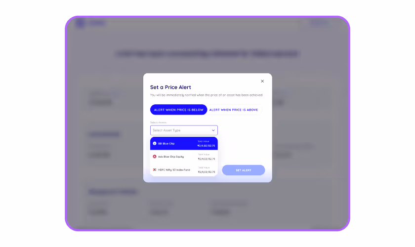
4. Modal Windows and Pop-ups
When you visit a new website, a window asks you to accept or reject its cookies. This is annoying, but it is an example of a modal window, a dialog box or a modal.
A modal window is a temporary pop-up box next to the current content. It requires users to interact before they can continue working.Modal windows are usually triggered by user actions such as mouse clicks or keyboard taps. They are generally designed with a semi-transparent dark background that obscures the main page
When and how to use a modal window?
- To provide valuable information
- To suggest subscribing to a newsletter
- To offer discounts
- To request information
- To confirm an action
- To show important messages- To give alerts
Real-life Application
Kommunicates website uses a huge modal window to alert the customer about the festive sale thats going on.
5. Forms and Input Fields
Forms you fill out when you visit websites are essential bridges between users and services. They gather information and enable interactions like registrations, feedback, and orders.
Their design can help you engage and retain visitors. As you learn about users, you can use this information to further their use. Forms guide users through signups, checkouts, feedback, and more.
Best practices for form design:
- Forms with placeholder texts, autofill and predictive text features save users time.
- Simplifying the structure of the form by asking text features save users time. concise questions and arranging questions wisely.
- Multilayer column layouts often create a lot of
- Form related sections to organize input fields into related sections. Group them by topic or theme to help users understand what you want to know in
- each part.
Real-life Application
As soon as you open the Airbnb website and attempt to use the services, it asks you to either sign in or log in to your account and presents a form for you to fill out
6. Call-to-Action (CTA) Buttons
A CTA, or call to action, is a prompt that encourages users to take a specific action, such as making a purchase, signing up, or downloading a resource.Buttons make the CTAs more prominent. They are typically placed above the fold, making them visible without scrolling down the page.
Placement significantly impacts the persuasiveness of the CTA. For example, a newsletter sign-up button would not be at the top of a blog post.
Things to keep in mind when designing CTA buttons:
- Buttons should be organized in a hierarchy based on their logical importance.
- Make sure that you give visual importance to buttons based on their purpose.
- Choose the proper shape, colour, and padding to make buttons stand out.
- Use legible typefaces and provide feedback when a button is clicked.
- Use visual symbols accompanying the text to make the buttons more accessible.
- CTAs should use direct and action-oriented verbs instead of indirect speech.
- Perform A/B testing of different CTA placements to see which performs best.
- CTAs should use contrast and whitespace so that the text stands out.
- Use multiple CTAs on long pages to break them up into sections and to break the monotony.
Real-life Application
Headspaces website uses CTAs like Try for free and Try 14 days free and uses contrasting colours such as blue and black to make them prominent.
7. Tooltips and Hover Effects
When you sign in to a new app, you see many pop-ups or bubbles explaining to you how tools and features work when a user hovers over an element. Arent those helpful?Tooltips are a UI design pattern that enhances discoverability and accessibility without cluttering the user interface (UI) by providing information when users need it.
How do tooltips help?
- Explain how something works by briefly explaining an element, such as a button, icon, or link.
- Ask users to take action by introducing them to a new feature.
- Helps new users during onboarding. - Highlight subtle changes in the UI interface that might go unnoticed otherwise.
Tooltips use cases
- New feature announcement tooltips announce product updates and overcome feature blindness.
- Interactive walkthrough tooltips combine a series of multiple tooltips to create a step-by-step guide. Such action-driven tooltips move forward or disappear when the user engages with another element.
Real-life Application
Flowlas website uses the hover effect; tooltips appear when you move the mouse over the component.
8. Progress Indicators
No matter how fast your website is, it still has some loading time, and users dont want to wait in vain because apathy is a tragedy. You had better include progress indicators so that users feel they have some control over the actions that take some time, like submitting a form, uploading a picture, or making a payment.Of course, the progress indicators have nothing to do with loading. It is common sense that people are more willing to wait when they see an indicator rather than when they are oblivious to how much time a task will take.Linear progress indicators, as the name suggests, are in the form of a line, and they display progress by the moving motion along the length of a fixed, visible track.A spinner or loading GIF again lets the user know that the site is processing a task, and they should be patient for a bit.A skeleton screen appears while users wait for a page to load, providing clues for how the page will ultimately look. It's a wireframe-like version of the page that mimics the layout and shows placeholder boxes for text and images.
Real-life Application
If youve ever made a LinkedIn profile, you must be familiar with its completion bar, which acts as a progress indicator. As you keep completing steps to your profile, the indicator shows how much of it is complete and what steps are to be taken next.The progress bars fill up as users keep adding information; this helps users visualise the progress. It helps motivate users to complete their profile and achieve an "All-star" profile.When users add more recommended sections, their profile becomes more discoverable in search results and increasesengagement.
9. Empty States
Empty states or empty screens are designed for moments in a users journey with a product where there is nothing to display. They are crucial in UI, but not all businesses pay attention to them.A useful empty state answers questions like
- Whats happening?
- Why its happening?
- What to do about it?
Four types of frequently encountered empty states:
First-use screens occur when you use a new product or service; there is nothing to show. For instance, Evernote shows an empty screen when you use a new note.User cleared screens appear when a message or task list is deleted.Error screens occur when theres something wrong with the website or the device or when the device faces internetconnectivity issues.No result/No data screens appear when the platform has no data to show.
10. Date Picker/Calendar
Date pickers are UI patterns that allow users to choose a specific date (or a range of dates), time, or combination of bothfor example, selecting a date of birth, scheduling a meeting or booking an appointment.Date pickers streamline the process of providing a service or product so that everything is planned out and does not overlap. Although this is not a meaningful pattern, people use different date formats worldwide.For instance, the United States uses the date format (mm/dd/yyyy), whereas the UK uses the day, month, and year format.Although these differences seem subtle, a database cannot distinguish whether the user uses the US or UK format. It can only decipher a date correctly in one or the other format.
Real-life Application
When booking a hotel on Agoda, a calendar pops up so the user can save the date(s) visually. Real-life Application
11. Dark Mode Toggle
Embrace the dark side with the growing dark mode. Dark mode isn't just a trend but has become necessary. It has several benefits, such as extended device battery life, enhanced aesthetics, reduced eye strain and saved electricity.It has grown in demand among users, especially the youth who spend extended screen time. It also gives a personalized feel, which will be one of the biggest UI trends in the future.
Real-life Application
Social media apps such as Instagram, Twitter, and WhatsApp are rolling out dark modes, and more and more people are using them.
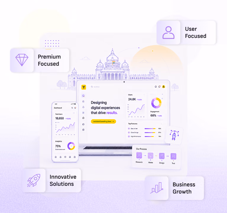
How Yellow Slice Helped KPIT to Ace their UI/UX Design
KPIT is a global partner to the Automotive Industry and Mobility Ecosystem for making software-defined vehicles a reaity.The Problem: KPIT executives inquired Yellow Slice about redesigning their portal so employees can quickly solvetheir travel needs. This project is solely dedicated to KPIT internal employees to assist with all their travel itineraries.The Solution: Yellow Slice designers designed a website tour to familiarize first-time users with the features andfunctionalities. We also created the manager interface to resolve issues by monitoring the employee's TR. The filter and status filter make this possible.We made their interface neater, cleaner, and more user-friendly. The emphasis on consistency helped ourUI/UX Designers leverage standard components like CTAs, Cards, and Travel cards.We do not want users to deal with multiple communication channels, so we made the travel request approval easierthrough the communication on the website. The employees can easily track the status of their requests and plan accordingly.
Let Your Business Experience a Slice of Excellence
We have worked with big names like Make My Trip, NPCI, Axis Bank, and Croma (and the list is long) and have picked up the best UX design practices. We take pride in advancing the human experience and deriving results for business with intuitions and facts.Ready to get a slice of digital experience? Visit our service page, and lets start designing your success today.
FAQs
1. What is the latest trend in UI design?
Some of the latest trends in UI design include:- Zero-UI follows a minimalist approach that uses gesture and voice-based controls to reduce the cluttered look of the interface.
- Live feeds and real-time website updates help users keep engaged.
- A modern and sleek aesthetic that builds on the trend of transparency and blurred backgrounds.
- A functional design that combines aesthetics with practicality by creating visually appealing designs that are also easy to use.
2. Why are UI design patterns important in modern interface design?
UI design patterns provide proven solutions for recurring problems, saving time and enhancing usability. They ensure consistency, effectively guide users and reduce cognitive load. By leveraging established patterns, designers can focus on creativity and functionality.

Let's create something amazing!
Let's discuss your vision and how we can bring it to life with impactful design solutions.
.avif)
Good design starts with Sliced Newsletter
Subscribe to the Sliced newsletter and get the best of research, UX writing, product psychology, CX, and design systems, right in your inbox.
